Do you know the PCA? A very useful method used in dimension reduction, discover how it works in this article.
What is the Principal Component Analysis?
Who has never had in his hands a dataset containing a very large number of variables without knowing which are the most important? How to reduce this dataset to represent it simply on 2 or 3 axes? Here is the PCA!
Principal Component Analysis answers these questions. PCA is a well-known method of dimension reduction that will allow the transformation of highly correlated variables into new variables that are decorrelated from each other.
The principle is simple: It is a matter of summarizing the information contained in a large database into a certain number of synthetic variables called: Principal Components.
The idea is then to be able to project these data on the nearest hyperplane to have a simple representation of our data.
Of course, dimension reduction means a loss of information. This is the challenge of a Principal Component Analysis. We must be able to reduce the dimension of our data while keeping a maximum of information.
How does a Principal Component Analysis work?
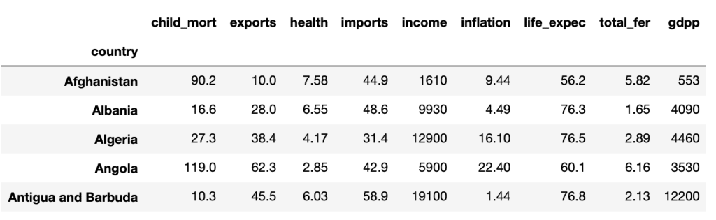
To illustrate the principle of PCA, we will take for example a dataset named ‘country_data’ which as its name indicates gathers several pieces of information (GDP; Average income; Life expectancy; Birth/mortality rate, etc…) on different countries.
Here are the first 5 lines:
Thereafter it is important to center and reduce our variables to mitigate the scale effect because they are not calculated on the same basis.
Once this step has been completed, we must see our data as a matrix from which we will calculate from which we will calculate eigenvalues and eigenvectors.
In linear algebra, the notion of eigenvector corresponds to the study of privileged axes, according to which an application of a space in itself behaves like a dilation, multiplying the vectors by a constant called an eigenvalue. The vectors to which it applies are called eigenvectors, combined in an eigenspace.
After importing the PCA module from sklearn.decomposition, the eigenvalues returned are
The eigenvalues are: [3.48753851 1.47902877 1.15061758 0.93557048 0.65529084 0.15140052]
These eigenvalues will allow us to determine the optimal number of factors/principal components for our PCA. For example, if the optimal number of components is 2, then our data will be represented on two axes, and so on.
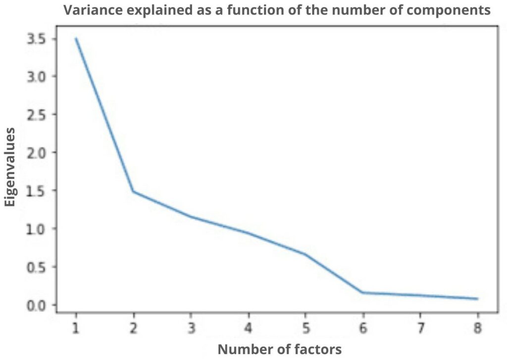
On this graph which represents the number of factors to choose from according to the eigenvalues, we indicate that the optimal choice of factor is 2 (thanks to the elbow method). Thus, we will go from dimension 9 to dimension 2 which considerably reduces the basic dimension. As said before, there will necessarily be a loss of information following this reduction. However, we still keep a rate of information of almost 70% which will allow us to have a representation close to my representation in 9 dimensions.
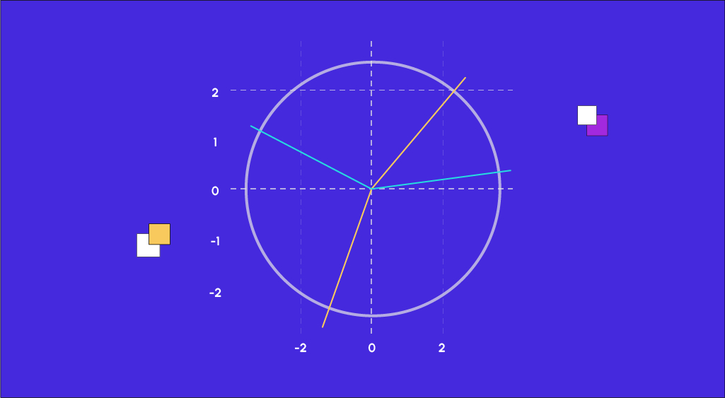
Once the PCA module has calculated the coordinates of our data, all that remains to be done is to represent them, but before doing so, we are going to take an interest in a tool that is very often used when performing a Principal Component Analysis, namely the correlation circle.

As our representation is done on 2 axes, the correlation circle is a practical tool that allows us to visualize the importance of each explanatory variable for each representation axis. The direction of each arrow indicates the axis explained by the variable and the direction indicates whether the correlation is positive or negative.
We notice that variables such as ‘income’, ‘gdpp’, and ‘health’ are positively correlated to the first axis, while ‘child_mort’ or ‘total_fer’ are also positively correlated but negatively. We can then look at the representation of countries in the two axes chosen by the PCA and see the influence of the variable ‘life_expec’ on their representations.
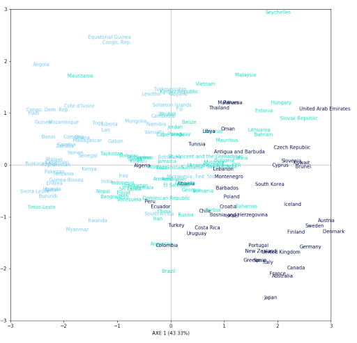
Here is a representation of each country (167) on 2 axes. To judge the quality of our representation, we decided to color each country according to the life expectancy of each one in 3 groups, we can observe a certain trend. We can then notice that the countries with a high life expectancy are concentrated in the lower right part of the graph. According to the correlation circle, the individuals in this part are partly explained by the variables ‘health’, ‘income’, or ‘gdb’. It can be concluded that countries spending more on health have a higher life expectancy. The same is true for the countries in the upper left part of the graph. According to the correlation circle, this part is mostly explained by the variables ‘child_death’ or ‘total_iron’.
If you want to learn more about Principal Component Analysis or other dimension reduction methods, there are several modules dedicated to it in our Data Analyst training.


