Seaborn is a Data Visualization tool in Python language. Discover all you need to know: presentation, use cases, benefits, training…
Data Visualization is a technique allowing Data Scientists to transform raw data into graphs and charts. Such illustrations facilitate the reading and understanding of data, which is why Dataviz is very useful.
There are many “no-code” tools to create data visualizations: Tableau, Power BI, and ChartBlocks… however, as an alternative, it is also possible to opt for the Python language.
This requires programming skills but offers complete freedom. Using Python, it is possible to manipulate, transform and create data visualizations. Many data scientists are turning to this solution.
One of the reasons why Python is the best choice for Data Science is its vast ecosystem of libraries. There are many Python libraries for manipulating data: numpy, pandas, matplotlib, and TensorFlow…
While Matplotlib is very popular for creating data visualizations, it can be complex to use. Some developers have created a new library based on Matplotlib: Seaborn.
What is Seaborn?
Seaborn is a library for creating statistical graphs in Python. It is based on zMatplotlib and integrates with Pandas’ structures.
This library is as powerful as Matplotlib but brings simplicity and new features. It allows us to quickly explore and understand data.
Entire data frames can be captured, and the internal functions for semantic mapping and statistical aggregation allow the data to be converted into graphical visualizations.
All the complexity of Matplotlib is abstracted by Seaborn. However, it is possible to create graphs that meet all your needs and requirements.
Seaborn and the different types of Dataviz
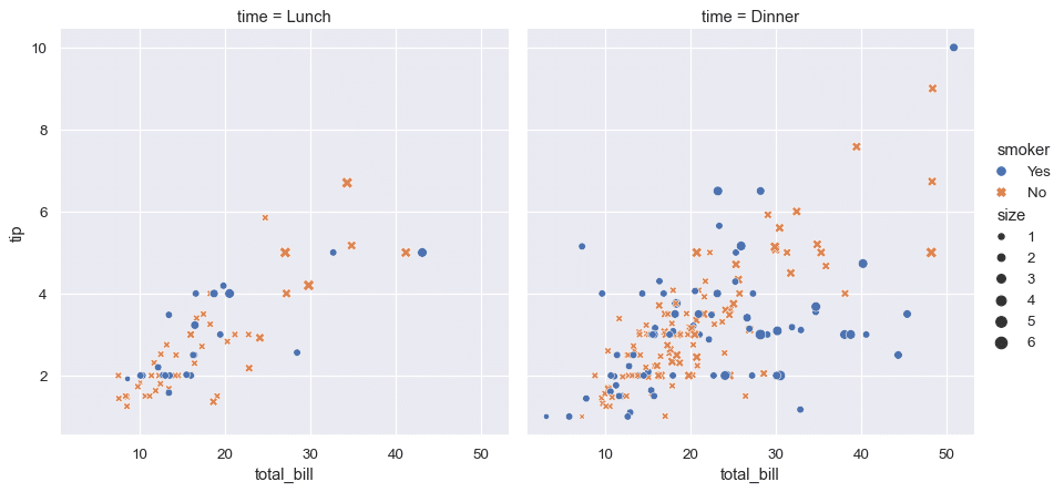
Seaborn provides different styles and default color palettes to create more attractive graphics. The different types of visualizations allow you to highlight the relationships between data. These can be numerical variables or groups, classes, or divisions.
Relational graphs are used to understand the relationships between two variables, while categorical graphs are used to visualize variables categorized by category.
Distribution graphs are used to examine univariate or bivariate distributions. Regression graphs add a visual guide to highlight patterns in a data set for exploratory analyses.
What are the benefits of Seaborn?
The Seaborn library offers several major advantages. It provides different types of visualizations. Its syntax is reduced and it offers very attractive default themes.
It is an ideal tool for statistical visualization. It is used to summarize data in visualizations and data distribution.
In addition, Seaborn is better integrated than Matplotlib for working with Pandas data frames. Finally, it is an extension of Matplotlib to create beautiful graphs using Python through a more direct set of methods.
Seaborn vs Matplotlib: which one to use?
Matplotlib and Seaborn are the two most popular Python tools for data visualization. Each one has advantages and disadvantages.
Matplotlib is primarily used for basic graphing, while Seaborn offers many default themes and a wide variety of schemas for statistical visualization.
In addition, Seaborn automates the creation of multiple figures. This is an advantage, although it can lead to problems with memory usage. Another advantage of Seaborn is the tight integration with Pandas and its Data Frames, although Matplotlib is also integrated with Pandas and NumPy.
On the other hand, Matplotlib offers increased flexibility in terms of customization and sometimes superior performance. It may therefore be a better option in some situations.
Overall, Seaborn is the best choice of DataViz tool for statistical data visualizations. On the other hand, Matplotlib is better for customization needs.
Why and how to learn to use Seaborn?
Data visualization is widely used in all business sectors. Therefore, mastering a DataViz tool is a valuable and coveted skill.
DataScientest’s data visualization training allows you to acquire this mastery. Both Matplotlib and Seaborn are included in the Data Visualization module of our Data Analyst, Data Scientist, and Data Management courses.
Through these courses, you can acquire all the skills required to work as an analyst, manager, or data scientist. In addition to DataViz, you will also learn programming, database management, Machine Learning, and Deep Learning.
Our various training courses adopt an innovative and beneficial Blended Learning approach, combining face-to-face and distance learning. They can be done in Continuing Education, or in BootCamp in just a few weeks.
At the end of the course, learners receive a degree certified by the Sorbonne University. Among the alumni, 93% found a job immediately after completing the training. Don’t wait any longer and discover our different training courses to learn how to use Seaborn and all the Data Science tools!
You know everything about Seaborn. Check out our introduction to Data Science, and our guide to getting started with Machine Learning.


