Over the past few years, we have been experiencing the phenomenon of Big Data, with an ever-increasing amount of data being generated. However, these databases are difficult to analyze at first glance, and only a small proportion of them are used by companies. The dashboard plays an essential role in this respect, providing an easy way of visualizing the essential information that emerges from the data. Find out how to use it to make real-time decisions!
What is a dashboard?
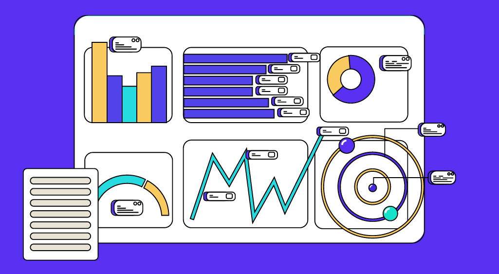
A dashboard is a tool that brings together the data from an activity and summarizes it visually, using performance indicators (KPIs) in particular. It focuses on the essentials, which is why it should ideally fit on a single page.
Today, the activities that require a dashboard are extremely varied. Let’s take a few simple examples.
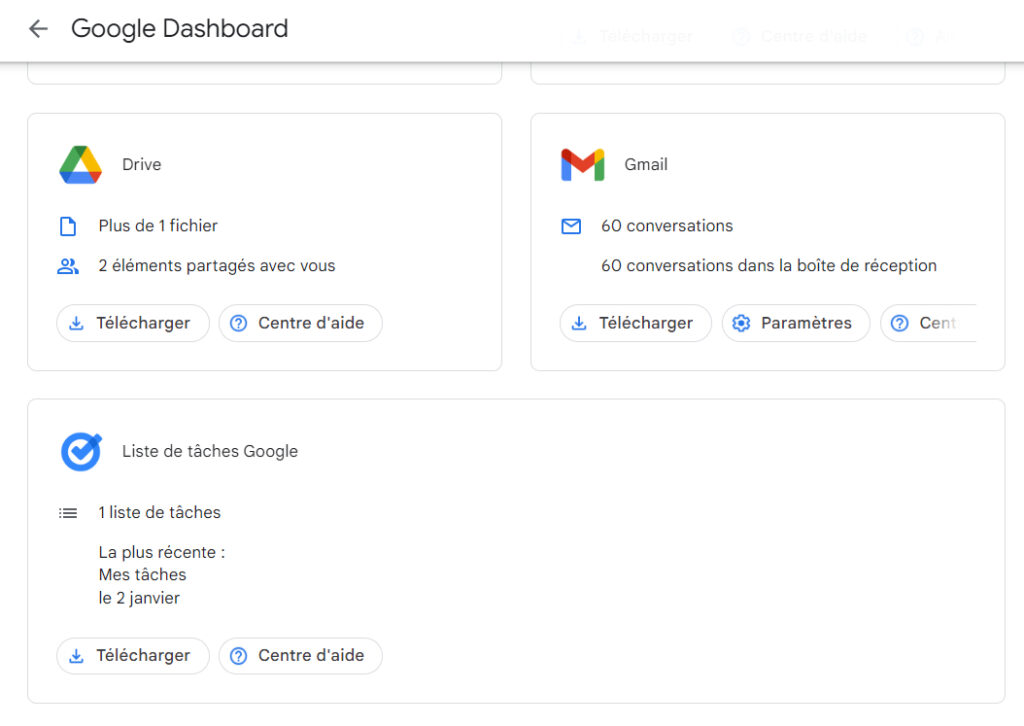
You probably have a Google account to search, reply to e-mails or consult your calendar. The way you use these services is summarized in a searchable dashboard. In particular, it provides Google with information on the number of visitors to its sites and its customers.
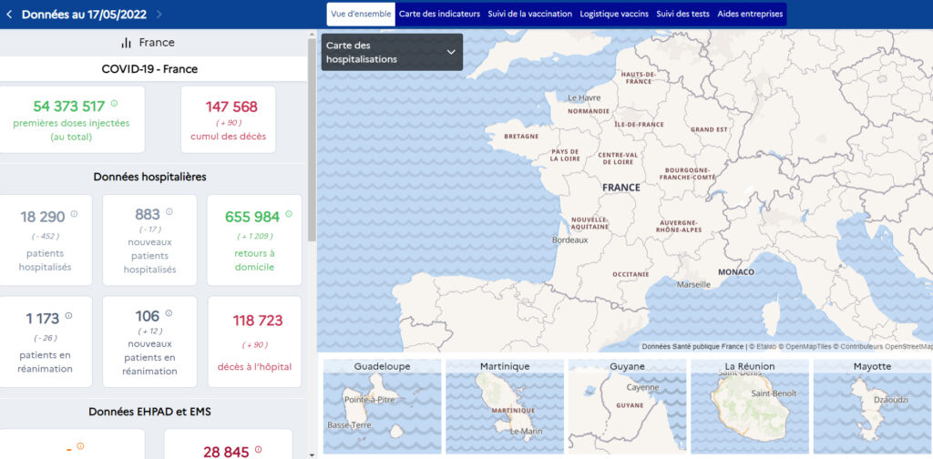
Another sector requiring this tool is healthcare. Indeed, this sector was particularly impacted by Covid. This dashboard gathered key data (hospital data, death data, vaccination data) and enabled the French government to take action as the pandemic evolved.
Why is a dashboard useful?
This data visualization tool, if regularly updated, gives companies an overview and helps them analyze the effects of their current actions in a minimum of time. In particular, it enables them to identify strengths, errors, and current trends, or to measure the effectiveness of actions.
The dashboard is therefore extremely useful in marketing, enabling you to make the best possible decisions in real-time and achieve your company’s ultimate objectives.
However, to be functional, the dashboard must be precise and adapted to the business.
How do you design an effective dashboard?
Step 1: Choosing the type of dashboard
We distinguish between the operational dashboard (performance of daily actions), the analytical dashboard (performance of all actions to be analyzed over a long period), and the strategic dashboard (performance of actions following a particular strategy over a certain period).
Step 2: Data selection
Not all data needs to be used. Only data relevant to the chosen KPIs should be selected.
- Consider merging data from multiple sources.
- Distribute the data and create a different dashboard for each business sector (sales, finance, HR, etc.).
Step 3: Personalize the dashboard
A clear, interactive, and personalized visual appearance ensures that you get the information you need quickly.
- Choose the data visualization techniques best suited to your needs. For example, diagrams can be used to break down and compare data, while line graphs such as curves are better suited to observing point data.
- Consider using existing tools (Google Charts for a basic dashboard, Google Analytics for a dashboard providing information on site traffic, or PowerBI for a varied dashboard capable of handling large-scale data) and adding widgets to customize them.
Step4: Dashboard accessibility
The dashboard must be quickly accessible, for example via a URL link (secure or not). This enables collaboration with other company members and people interested in the business.
Step 5: Updating the dashboard
It is possible to automate the update of the dashboard when new data is added.
In conclusion the dashboard is an indispensable data visualization tool in the age of Big Data. It enables companies to observe the impact of their actions in real-time, and is therefore extremely useful for decision-making!
Now that you know all about dashboards, you may want to learn how to use them in your data projects. DataScientest invites you to discover our data training courses.


