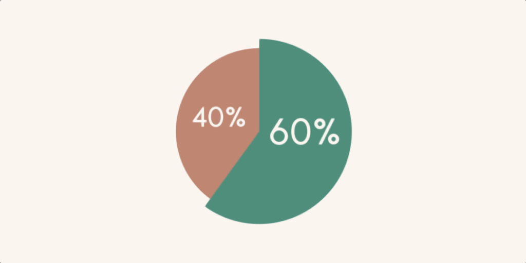
Series of data spread over several rows often lack legibility. To make it easier to interpret the information in an Excel table, it's best to create graphs or an Excel pie chart.
With Microsoft, you can present data in a variety of ways: scatter plots, histograms, stacked bars and, of course, in an Excel pie chart. In this article, we take a closer look at pie charts.
Why make an Excel pie chart?
Sector graphs are mainly used to display the distribution of different sets of data.
For example, for a company selling smartphones, it may be interesting to know which model generates the most sales (and vice versa)
The Excel pie chart can then be used to quickly visualise the share of iPhone, Samsung, Huawei, etc. sales.
This pie chart is useful not only for sales, but also for all other aspects of an organisation’s activity (the gender breakdown, the proportion of senior staff, the proportion of French and/or European suppliers, customer profiles, etc.).

How do I create a pie chart in Excel?
The simple pie chart
To create an Excel pie chart, simply follow the steps below:
- Select the data on your worksheet (whether it’s in rows or columns);
- Click on “Insert” ;
- Click on “Insert a pie chart or ring chart”.
You can then choose the type of Excel pie chart you prefer (3D, 2D, ring or other).
From here, you can customise your chart in Excel. There are several icons next to the chart, each with a different function:
- Data element (Plus button): this lets you format your pie chart. For example, by adding a chart title.
- Series property (Brush button): this icon lets you modify the appearance of the chart, whether in terms of style, the colours of each portion, the display of numerical data, etc.
- Filter: you can display or filter certain data that are not relevant to your analysis.
Thanks to the various customisation parameters, the Excel pie chart is an essential visualisation tool that allows you to highlight the main data in your reporting.
Good to know: the data selected must give an overall result of 100%.
While the Excel pie chart is very simple to use, many analysts want to customise their chart to make it more explicit. Fortunately, Microsoft Excel offers a number of graphical tools for creating all types of Excel pie charts.
How do I display percentages on a pie chart?
The data in the Excel pie chart is generally raw data. To take the example of smartphone sales, the pie chart shows that the company sold 1,000 iPhones, 500 Samsung, 500 Huawei, etc.
But if you wish, you can also transform this information into a percentage. To do this, simply click on “Series property” and select #PERCENT in the “Custom caption text” tab.
How do you make a half pie chart in Excel?
This type of graphic is particularly used during elections to represent the different political parties. If you would like to obtain this type of visual result, simply go to the ‘Series property’ button, and follow the steps below:
- Insert a “Total Amount” line in your data table;
- Create your graph and click on “Format the data series”;
- Go to the “Graph” tab;
- Change the angle of the first slice to 270º;
- Return to the graph and click on “Total Amount” in the legend;
- In the “Data point format” pane, click on “No fill” ;
- Remove the Total from the legend.
How do you highlight certain data?
If you want to highlight a specific set of data, this is possible with the Excel pie chart. For example, companies wishing to know the proportion of senior employees can create a chart in sections indicating the age of the employees (under 25, between 25 and 35, over 55).
Very often, senior employees are not the most numerous category within organisations. So to make them more visible, you can highlight the percentage on your pie chart. To do this, simply drag the category to the outside.

How do I add data labels?
Data labels highlight certain information to make your pie chart easier to read in Excel.
Here are the steps to follow:
- Click on the Data Element button;
- Tick “data labels” ;
- Select the location.
Optimising your graphics
Here are a few additional tips for optimising your pie chart:
- Only one set of data: for example, if you want to show the breakdown of the different products that make up your sales and the brands for each product, you will need to create several pie charts in Excel.
- No zero or negative values: these will not appear on your chart.
- A maximum of 7 categories: Otherwise, here is a risk that the chart will become illegible. The pie chart is designed to simplify data visualisation.
Things to remember
Excel spreadsheets can be used to produce all kinds of charts. In particular, the pie chart. This is particularly useful for displaying the distribution of data. Depending on your needs, you can customise your Excel pie chart to highlight the most important information.


