Do you want to leverage data with Power BI, especially from your Excel files? Check out our tutorial on how to transform pivot tables into actionable datasets.
When you want to work with data in Power BI, you have various options for your data sources. Among them is the ability to work with your Excel files, making it easier to automate and exploit the data within them.
However, often the format of your data in the spreadsheet is not suitable for direct use in Power BI. Indeed, Microsoft’s Business Intelligence software only accepts data stored in the form of tables. This terminology refers to data organized in the form of tables, where columns represent categories of information (phone number, date, time, text, integer/decimal numbers, etc.), and rows represent data records or entries.
Ex :
Name
First Name
Age
Profession
MOREAUX
Antonin
27
Developer, Writer, Trainer
FELLOUS
Aurélia
-
Head of Marketing
However, this data organization method is not always the most visual. Many Excel users prefer to organize their tables in their own way. As soon as this data needs to be used to create dashboards, it quickly becomes challenging to utilize these resources.
For example:
In this article, we will detail the acquisition and transformation of an Excel file in the form of a “pivot table” before using its data to create a complete dashboard.
Acquisition of an Excel file
As mentioned above, Power BI accepts various data sources, including the spreadsheet software from the same creator: Microsoft Excel. In this section, we will see how to load an Excel file into Power BI.
1. Loading a new data source
In the “Home” tab, you will find the following tools:
Click on “Excel Workbook,” and your file explorer will open. From there, you can select the file you want to use.
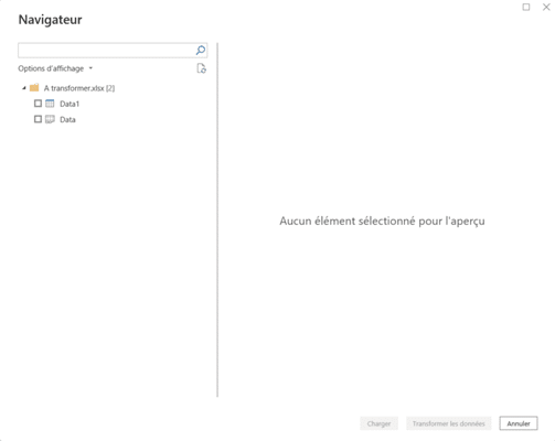
Once you’ve done that, a new contextual menu will appear:
This menu allows you to select the item you want to interact with. With Excel, Power BI recognizes sheets as well as tables declared in Excel. You can differentiate these elements through the associated logos:
– Sheets:
– paintings :
Bear in mind that if you select a sheet, Power BI will load all the data present, not just the selected table.
Once you’ve selected the desired item, you have two options:
1. Load the data directly into Power BI Desktop and start creating visuals. 2. Transform your data using Microsoft’s data transformation engine, Power Query.
2. Transformations with Power Query
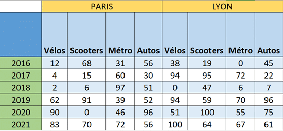
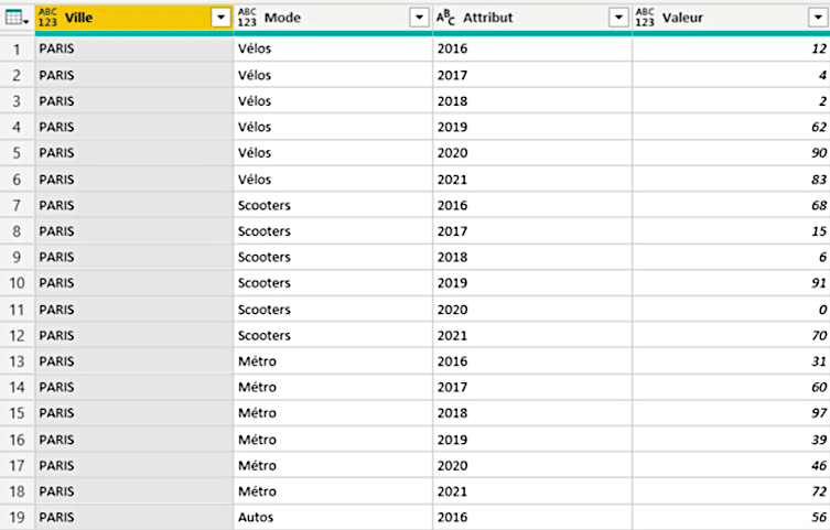
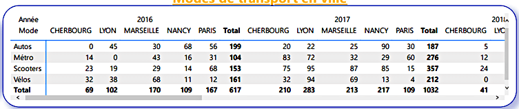
In this article, we will explore this second option through an example of a pivot table created in Excel. Pivot tables are widely used because they allow for quick and easy reading of data, with entries arranged in rows and columns.
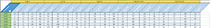
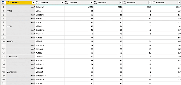
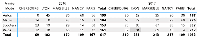
In the example below, we have a table that stores data about modes of transportation in major French cities over time.
In this type of table, users can read the data with multiple entries:
– The first column entry for city names. – The second column entry for modes of transportation. – The third row entry for the years in question.
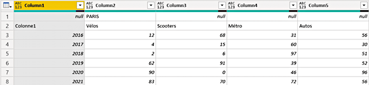
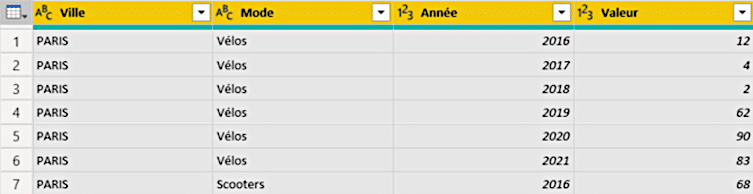
But Power BI cannot utilize data presented in this way. To make this table format usable, several transformations need to be performed using Power Query.
Indeed, Power BI loads the data in the following format:
This data format is not suitable and must be adapted using the following list of transformations:
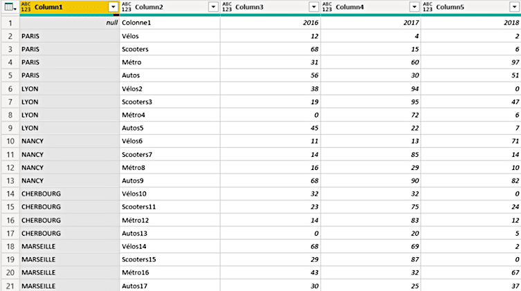
First, you need to unpivot the table once using the “Transpose” tool.
then, use the “Fill Down” command.
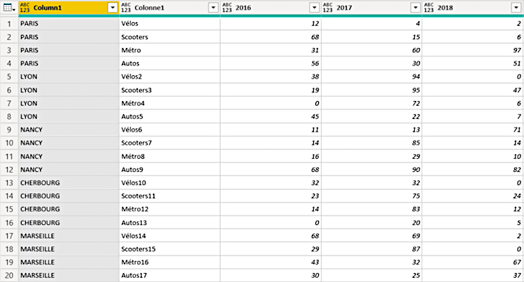
to use the first row of the table as headers, we use the “Use First Row As Headers” tool.
we rename our columns to make them easier to work with.
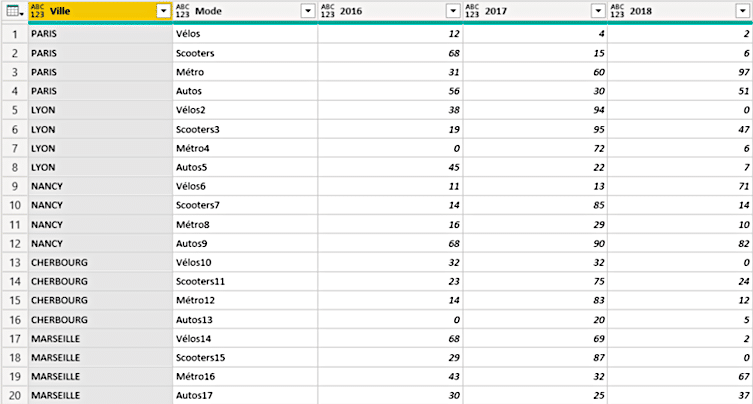
we once again remove the pivot table by selecting the correctly formatted columns (City and Mode) and using the “Unpivot Other Columns” tool.
we then detect the data type by selecting the entire table and using the “Detect data type” tool. This enables us to detect numerical data, and thus perform mathematical operations on this data.
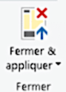
The data is now ready to be used in Power BI Desktop. We can then use the “Close & Apply” command:
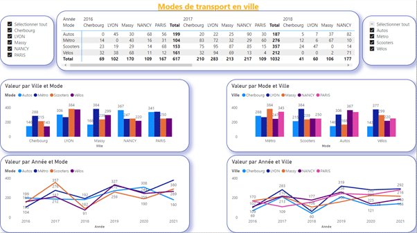
In Power BI Desktop, you have the ability to create visuals very easily. In this section, we will detail the process of creating the visuals for the dashboard presented below.
1. The title
To optimize the user experience, every dashboard should include a simple, unambiguous title that relates to the developed visuals. The title should allow users to immediately understand the context of the dashboard.
In terms of methodology, I use the “Text Box” tool in the “Insert” tab. I then format it as needed for the users.
2. Segments
In Power BI, segments are tools that enable you to filter the data you display, according to different criteria:
textual (city or country names, product group, team name, etc.) ; numerical and chronological (between, after, before, etc.).
- Methodology
To create a segment, click on the visual “Segment”.
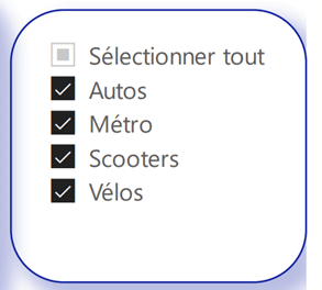
Choose the city:
You can then customize the shape and functionality of the segment as you wish, thanks to the “Visual format” pane:
- Business Intelligence
In Business Intelligence, the notion of filtering refers to the action of a field or table on a set of data or measures. In Power BI, if you use a segment to filter your data, the field applied to it will need to be chosen carefully. A field can filter:
data from the table to which it belongs;
the data of the table(s) located on the “several” side of a “one-to-many” relationship (the filter field is on the “one” side of the “one-to-many”
relationship).
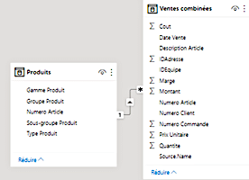
In the example below, fields in the Product table can filter the Sales table combined.
Thus, the cities segment can filter cities displayed on other visuals.
3. The matrix
Dans Power BI, le visuel matrice permet de représenter des données en fonction de catégories communes, en lignes et en colonne. Dans notre exemple, les années sont résumées en en-têtes de catégorie de colonnes, déclinées ensuite entre les différentes villes. En ligne, nous retrouvons les différents modes de transport.
- Methodology
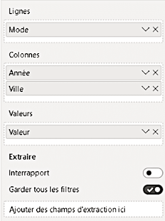
To create your matrix, click on the “matrix” visual
then drag and drop the various fields as follows:
You can then move up the hierarchy you’ve created: each year includes data for several cities.
using the tools at the top right of the display
In the “Design your visual” area, you’ll have access to a wide range of customization options for your visual.
- Business Intelligence
Power BI’s matrix visuals are reminiscent of Excel’s pivot table tool. Indeed, they are functionally oriented in the same way: grouping data by category, and aggregating them according to the desired calculation.
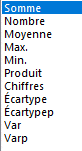
The major difference lies in what you can decide to represent in the matrix. In Excel, you can aggregate your data according to the classic calculation modes:
But in Power BI, you can represent your measurements in a matrix. As a result, the calculation possibilities are infinite, and no longer limited to conventional mathematical operations.
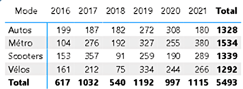
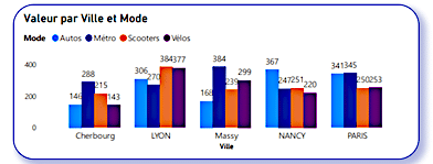
4. Grouped histograms
Histograms are one of the great classics of visual data representation. Who hasn’t represented a quantity organized by class on a histogram?
In our example, we represent the total for each mode of transport, classified by city. This visualization enables us to compare different values quickly and visually.
- Methodology
To create your grouped histogram visual, click on its logo
then fill in the various fields as follows:
You can then customize the various visual options as you wish in the “Shape your visual” section:
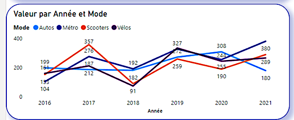
5. Curve graphics
Like histograms, curve graphs are among the most widely used graphs. And for good reason: they’re the best way of representing the evolution of a quantity as a function of time.
In our example, we show the evolution of the total for each mode of transport (all cities combined) as a function of time. This graph allows us to visualize the temporal evolution of our quantity, and thus to analyze the behavior of the population studied.
- Methodology
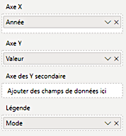
To create your curve graph, select its symbol
then fill in the fields as follows:
You can then customize the various visual options as you wish in the “Shape your visual” section:
Interaction between visuals
The great strength of Power BI is undoubtedly the interactivity between dashboard visuals. Indeed, clicking on a graphical element will act as a filter on the selected data. This is particularly useful when you want to delve deeper into your data, and isolate certain characteristics.
To modify this feature, and decorrelate visuals from one another, select the element on which you wish to act.
Then go to the “Format” ribbon, “Modify interactions”, and click on the item below to disconnect the desired visual.
or the item below to reconstruct the link between the elements.
Conclusion
Acquiring, transforming and representing data has never been easier than with Power BI. Microsoft’s Power BI software is versatile, intuitive and allows you to go a long way in analyzing your data.
In this article, we focus on one of the most common transformations: the de-ivisioning of a pivot table. These are commonplace in Excel spreadsheets, thanks to the readability they provide.
Once transformed and tabulated, the data can be used to create visuals and an entire dashboard. Power BI lets you interact with all the visual elements of your report.
If you’d like to deepen your knowledge of Power BI and obtain certification, we invite you to take the DataScientest training course or read these related articles💡: