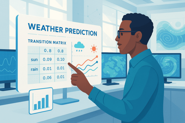
Data Viz" allows you to represent your raw data in graphical or infographic form to make it easier to understand.
With the advent of Big Data, and the multiplication of data sources, companies are increasingly turning to data visualization. These visual representations make it easier to understand raw data, and thus aid decision-making.
The benefits of Data Visualization
Have you just finished analyzing your company’s data and need to present it to your colleagues, management or a group of investors? Forget the Excel spreadsheet and go for Data Visualization!
Data Visualization offers you a set of techniques for transforming raw, often complex data into highly accessible visual representations. By making this raw data accessible and easy to understand, you can save your staff time and facilitate their decision-making.
What are the main data visualization tools?
Used primarily to create dashboards or produce data analysis reports, datavisualization tools are often under-exploited. While Google Analytics graphs are well known as good indicators of website performance, there are other tools available to help us understand the raw data contained in our Excel spreadsheets.
MicroStrategy enables us to analyze data using visual representations, and proves invaluable in all business analysis and reporting. The system offers a single, integrated platform, with numerous options available or not, depending on the user’s role. The tool is directly accessible on the web and on mobile devices, enabling anyone to connect from anywhere.
Microsoft Power BI is a suite of analysis tools that operates mainly on Azure, the American firm’s cloud manager. Power BI also features a data representation tool and generates ad hoc analyses. Users also benefit from a free data analysis tool and free mobile data visualization applications.
Data Storytelling: telling a story with your data
It’s not enough to show a few graphs and histograms on a screen to help your audience understand the meaning of your data. The best way to make your presentation easier to understand is to organize it in the form of a story. This story will enable you to draw attention to the most important elements of your presentation, explain the relationships between different sets of raw data and the consequences of one data source on another. But beware, data storytelling can’t be improvised. Here are a few rules to observe to ensure that the story you tell is well understood by your collaborators:
Adapt your data visualization to your audience and the message you wish to convey.
Knowing your audience’s profile is extremely important before you start representing your data. Depending on their experience of data, they won’t react in the same way to the graphics you present to them. So make sure your audience speaks the same graphical language as you do!
In the same way, keep your data representation simple, and don’t overload your graphics… Remember the purpose of your presentation, and only show the information you need to convey your message, so as not to drown your audience in too much information and divert their attention.
Choose the right visualization for your data
For the most effective visual representation, you need to use the right graphics from the almost infinite choice available to you. Among the most commonly used graphics are bar charts, diagrams, scatter plots and pie charts.
Understanding the importance of text in visualization
Although we’re talking about data visualization, we mustn’t forget the importance of text… In many cases, legends are vital to understanding the organization of graphs. Titles, subtitles and explanatory text also help to give context to the visualization and facilitate the reader’s understanding. Be sure to use short sentences, avoid repetition and keep fonts and colors legible.
Knowing how to use color
Let’s talk about color! Color is essential to liven up your presentation and contribute to the reader’s overall understanding. Conversely, a red arrow means something sterile in the common imagination. On the other hand, misuse of these colors can easily mislead the reader and convey the wrong information.
Keeping these rules in mind is essential to the proper understanding of your data analysis. In fact, the wrong choice of data representation, the wrong color code, or an overly present or repetitive legend can disrupt the message and make the visualization confusing very quickly. It will then be difficult for you to make up for this confusion orally, and bring your audience back on track with the story you want to tell and the objective you’re aiming for.
Become an expert with Track Data visualization from Data Scientest
Would you like to become a Data Visualization expert and produce graphics and storytelling tailored to each of your presentations?
Join DataScientest’s Data Visualization track! In 35 hours of training, you’ll master and customize a wide variety of graphical renderings, and learn to adapt them to your data analyses, applying storytelling best practices to facilitate their understanding and support your objectives in front of your company!
You’ll also be able to create interactive Dashboards to give even more meaning to your data.
Finally, you’ll have all the knowledge you need to create and integrate an interactive graphic into a web page, and distribute your data visualizations to the four corners of the globe!


