Google Data Studio is a data visualization tool distributed free of charge by Google. It allows you to generate interactive, dynamic graphs from data from one or more sources in a highly intuitive way. Despite this ease of use and the fact that the service is free, Google Data Studio is used today by many companies for business and marketing decision-making.
What is Google Data Studio?
Among Google’s data analysis tools, Data Studio is the one that lets you create customized visuals that you can share in real time. Its main functions can be summed up in three points:
View data
Here, Data Studio offers a function where you transform your data into interactive reports and dashboards that are easy to read and share. What’s more, these are fully customizable. In this way, you can:
Tell the story of your data using interactive graphs (lines, bars, sectors, maps, paginated data tables, pivot tables, etc.).
Make your reports interactive with reader filters and period controls. With data control, you can transform any report into a flexible template that anyone can use to display their data.
Insert links and clickable images to create product catalogs, video libraries and other hypertext content. Customize your reports by adding text and images.
Data Studio reports collect information from one or more specific data sources. With the Data Sources tool, you can easily connect to a wide variety of data, without having to program anything. In just a few moments, you can connect to data sets such as Google Marketing Platform products.
Other data sources are Google consumer products such as Sheets, YouTube or Search Console. They can also be files without an internal hierarchy by downloading CSV files and Google Cloud Storage, or databases such as BigQuery or MySQL.
Sharing and collaborating
Reports and data sources are stored as files on Google Drive. To give your data one, embed your reports on other pages such as Google sites, blog posts, marketing articles and annual reports. If you share your reports or data sources with another editor, you can work with that person on the same files.
How does Google Data Studio work?
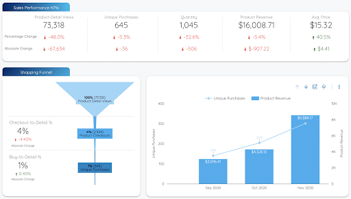
Here is an example of an e-commerce dashboard created with Google Data Studio :
You can find more dashboard templates in the Google Data Studio gallery.
Pretty, isn’t it? Google Data Studio provides you with a multitude of easy-to-use tools that will enable you to customize your dashboard.
So how does it all work, and what are the basic tips you need to master to get to grips with this tool?
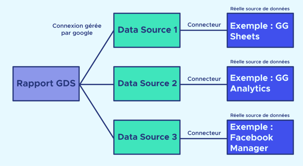
When you create a report, you can connect several data sources to it. Each data source (called a data source in Google Data Studio) corresponds to a uniform data structure. It’s the same structure whether you’re sourcing your data from a Google Sheets, Google Analytics or Facebook file. Upstream, a connector takes care of retrieving the data by connecting to the API of the “real” data source (i.e. where the data is actually collected and stored).
How do you create a Data Source and connect it with a Connector?
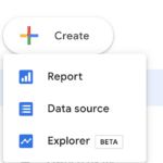
Create your Data Source by clicking on “Create” then “Data source”.
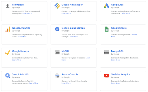
You will then be redirected to a page asking you which connector to choose. There are many different connectors, coded differently to suit the multitude of real data sources out there. You can explore them in the Google Data Studio connector library. There are many of them, but remember that all those from Google are available free of charge. Everything else can be retrieved by connectors developed by third-party companies (Supermetrics, Funnel, etc.), which you can access by paying a subscription fee.
And yes, you now realize that only data from Google’s services (the web, YouTube, Google Sheets, etc.) is really accessible free of charge on Google Data Studio. Well, almost! You can always code your own connector, but that’s a bit complex for someone with no programming skills. However, if you’re interested, Google provides a very detailed guide.
How do I create a report?
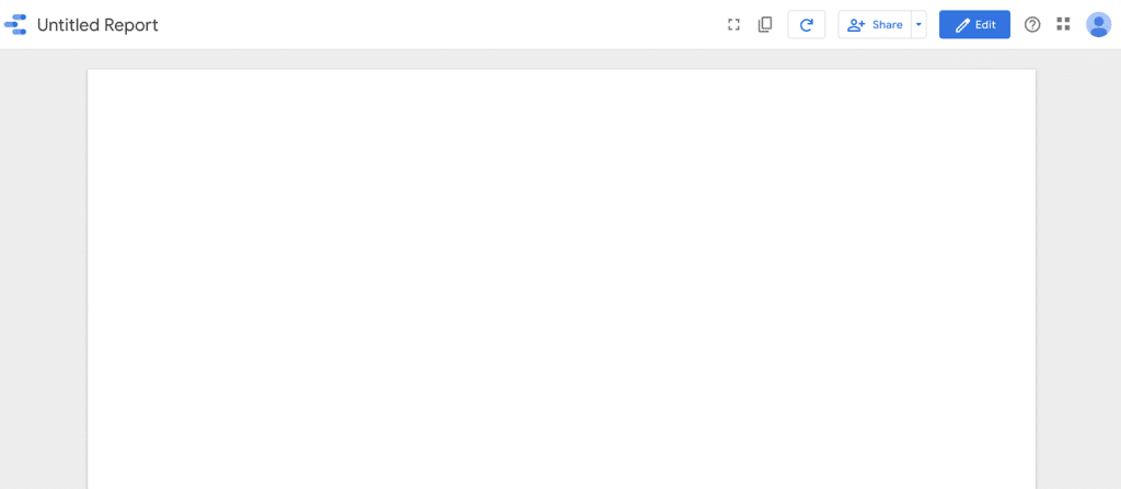
When you create your report, you will have to choose your Data source, then you will have access to a blank report:
This is the “View” mode of your report. This display mode gives you access to dynamic, interactive data visualization (date selection, table sorting by column, etc.). By sharing the link to this report with others, they will have access to this View mode only.
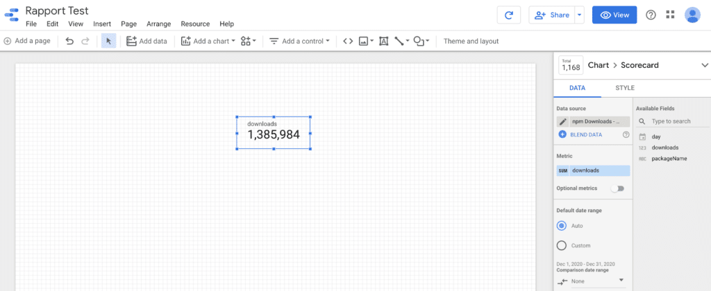
Now let’s press Edit to access the editing mode
This editing mode breaks down into 3 main parts:
The worksheet: this is where you add your various indicators and graphs (this is what’s accessible in View mode).
The toolbar: at the top of the worksheet, you’ll find the various graphs and controllers you can add to your worksheet.
The settings column: when you select a chart, you have access to all its settings (data source, metric, date…) and to the choice of its style (color, font…) in the right-hand column.
The essential charts
The charts you can display in your report are available by clicking on Add a Chart in the toolbar.
Here are some basic charts you’ll need to create your first report:
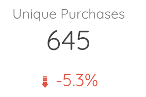
The scorecard :
It’s a simple indicator, counting the number of occurrences of the metric you’ve chosen.
In the settings (right-hand column) of a scorecard, you can :
Choose the date range over which you count the number of occurrences of your metric
Choose a filter to apply. A filter is set by choosing conditions on another metric
For example, in a marketing campaign, you could set a filter as follows: include all hits that verify: my campaign name contains “France”.
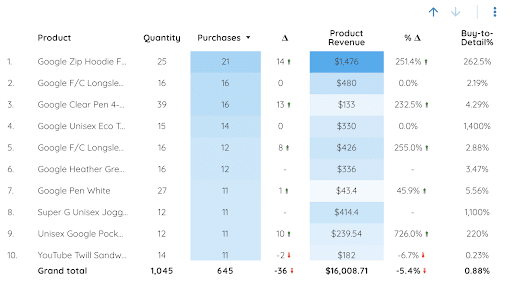
The tables :
Tables allow you to view several metrics at the same time (several columns). In the table settings, you can :
Do exactly the same as for the scorecard
Choose a dimension. For example, if you choose country as a dimension, each row will show you the values of the metrics you’ve chosen, grouped by country.
In the style, you can choose to color the strongest values with a certain color.
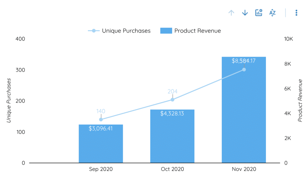
Time series :
Times series allow you to see the evolution of a metric over time. They are parameterized in the same way as tables, but their dimension is necessarily the date.
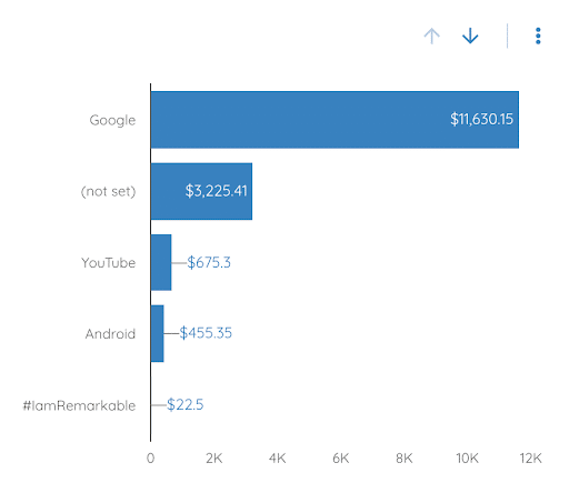
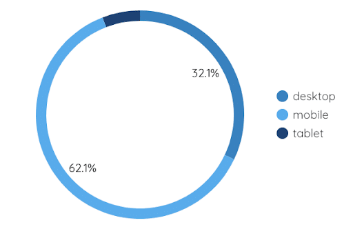
Bar and pie charts:
More pretty graphics. They can be set up in the same way as a table. All you need to do is add, in the dimension section, the metric according to which you want to perform your breakdown.
Finally, you can also add controllers on which viewers of your report can interact to make it evolve dynamically.
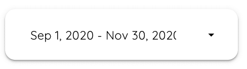
The date range :
This controller allows the report viewer to modify the date range over which all the metrics in your report are calculated.
Together, we’ve seen how to create a data source, as well as the first basic charts in Google Data Studio. You’ve seen how easy it is to create a report. And yet, GDS is a powerful tool with numerous customization options. Now you’ve got the basics to create your first report and discover all the tool’s hidden features.
If you want to learn how to master Data Viz tools with greater control and formatting possibilities, such as Matplotlib: Bokeh and Seaborn, our Data Analyst training course is for you.
Facebook
Twitter
LinkedIn
DataScientest News
Sign up for our Newsletter to receive our guides, tutorials, events, and the latest news directly in your inbox.
You are not available?
Leave us your e-mail, so that we can send you your new articles when they are published!