Data visualization is an indispensable approach for all data analysts: it provides clear, intelligible information that can be easily communicated to all kinds of audiences. Treemaps are an important tool in data visualization, and must be mastered by data scientists and data analysts alike.
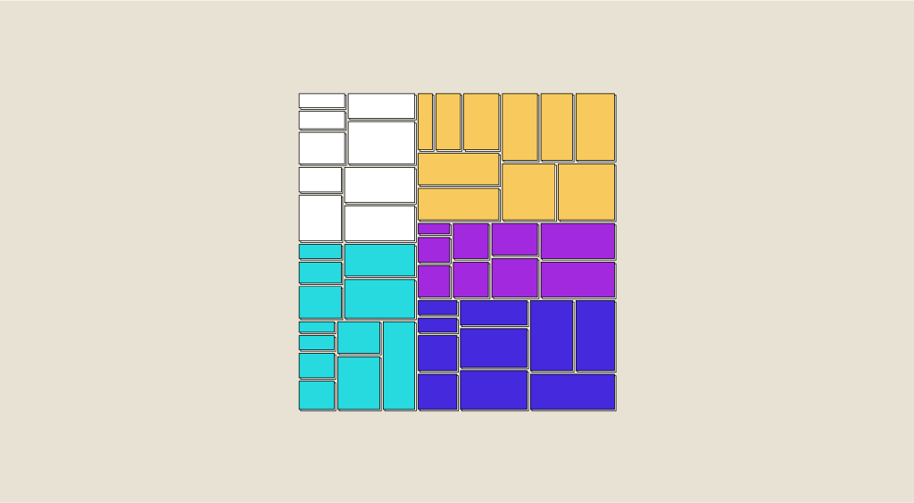
The Treemap, or proportional map (or box map), is a representation in a limited space of hierarchically organized data (although it can also be applied to non-hierarchical data). At first glance, a Treemap might resemble a chessboard in which each square has variable dimensions, and in which groups (or clusters) of squares with similar colors can be distinguished.
This representation makes it easy to compare squares within each cluster, squares across clusters and clusters between themselves. Because of its simplicity and effectiveness, Treemap is used in a wide variety of fields: finance, demographics, industrial production, marketing and so on.
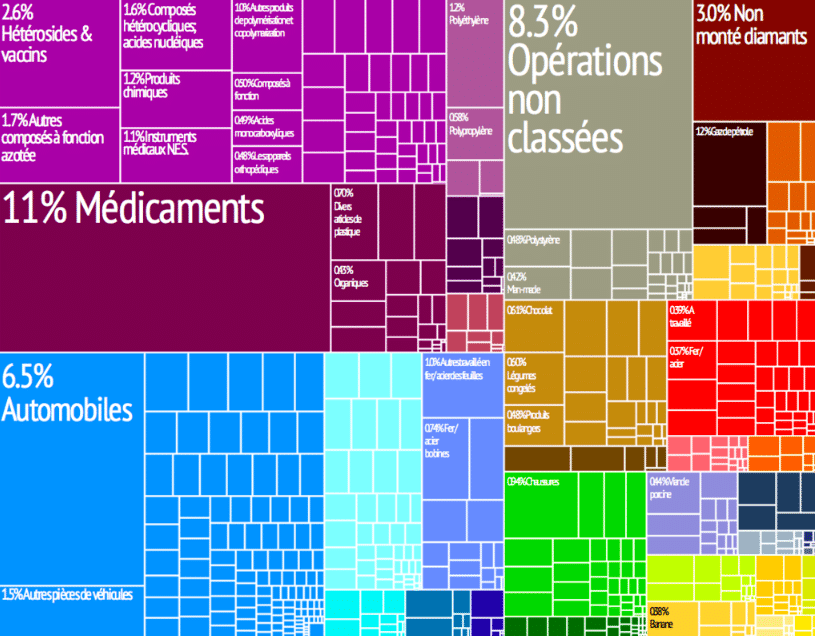
For example, it can very effectively represent the relative weight of each industry in each of a country’s export sectors, or the relative size of different assets according to their specific nature in a financial portfolio, etc.
How did the Treemap come about?
The Treemap is the brainchild of Ben Shneiderman, Professor of Computer Science at the University of Maryland and creator of the Human-Computer Interaction Lab. Shneiderman wasn’t interested in his country’s various export sectors, nor in a financial portfolio. On the contrary, he simply wanted to find a quick solution that would allow him to represent all the files, directories and folders on the hard disk. Shneiderman needed to represent hierarchically organized data (folders and files within folders) in a small space. It seemed obvious to him that diagrams that could represent a hierarchical structure by following a tree structure had a major drawback: with all the nodes and their branches, they quickly became too large and unmanageable.
Shneiderman therefore needed to find a solution for representing a hierarchical tree structure within a space-constrained framework: he invented the Treemap. In a single rectangular graph, he could observe the entire hierarchical organization of his data on the hard disk. Thanks to its simplicity and clarity, the Treemap has become a household name in the world of data visualization.
Treemap: What's its strength?
The larger rectangles represent the main branches of the tree, and are divided into smaller rectangles corresponding to the different nodes (or sub-branches) of each branch.
The numerical value of the data corresponds to the area of each rectangle. This organization is Treemap’s main asset.
Indeed, thanks to this organization, which consists of a rectangle structure in a restricted space, Treemap enables us to compare quantities in a very direct and efficient way, and to highlight the trends that structure our data.
Rectangles of different sizes and colors are used not only to show the different elements of the database and their organization, but also to distinguish variables and modalities with greater weight from those with more marginal weight.
Treemaps can therefore be used to represent rankings, differences between different parts, relative proportions and so on.
Although the Treemap is designed to visualize hierarchically organized data, it can also be used to process non-hierarchical data. When Treemap deals with non-hierarchical data, it becomes an alternative to the classic pie chart, which represents one part in relation to the whole.
The big difference and advantage of the Treemap is that, unlike the pie chart, it can include dozens (or even hundreds) of elements. In this sense, the Treemap can be an alternative to the bar chart: indeed, when our data is made up of a large number of elements, a bar chart would be impossible to represent in a graph. In such a case, we can use a Treemap that allows us to represent dozens of modalities through dozens of rectangles.
# Create a Treemap representing DataScientest with python's plotly library
Applications and limits
Today, there are several algorithms for representing hierarchical data using Treemaps.
These include Squarified, Slice and Dice, and Stripped: these algorithms are extremely simple and easy to implement. In particular, Squarified is one of the most widely used algorithms for its representational qualities. It creates blocks that are as square as possible and arranges them in descending order of size. This facilitates comparison between elements.
Thanks to these properties, Treemaps are widely used in Business Intelligence (BI). However, they only provide a representation of the major trends present in the data, and do not enable precise comparisons or the analysis of relationships between variables.
A visualization tool such as Treemap should be part of the toolkit that Data Scientists and Data Analysts can mobilize. If you train in Data Science, you’ll certainly learn how to use these tools.


