In this article, we will explore the fundamental concepts of ggplot and learn how to create a chart using this library to effectively present your data.
What is ggplot?
ggplot is a data visualization library in R, developed by Hadley Wickham in 2005. This library is based on the grammar of graphics, which allows describing graphs in terms of basic components such as axes, legends, or labels.
With ggplot, you can think of a graph as a series of layers that stack up to produce the final graph. Each graph layer can be added using the + function and can include elements such as points, lines, bars, scatterplots, histograms, boxplots, text, and much more.
To create a graph using the layering system in ggplot, start by specifying the data and the variables to use for the x and y axes, then gradually add additional graph layers.
One of the most commonly used graph layers involves geometric functions using the appropriate geom_ functions.
Here are some examples of geometric function graph layers:
– geom_point(): adds points to the graph
– geom_line(): adds a line to the graph
– geom_bar(): adds a bar chart to the graph
– geom_histogram(): adds a histogram to the graph
– geom_boxplot(): adds a boxplot to the graph
– geom_text(): adds text to the graph
Please note that each graph layer can be customized using function-specific options.
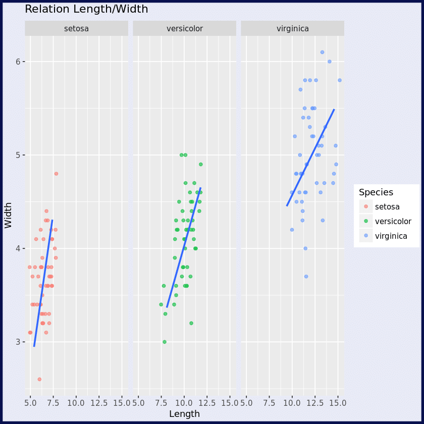
To understand this principle, let’s take a step-by-step look at how to create the following chart with the Iris dataset.
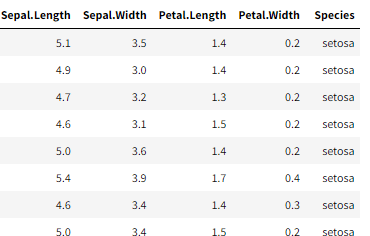
Here is an overview of our data:
Step 1: Load the ggplot library and read the csv file
library(ggplot2)
iris <- read.csv(“species.csv”)
Step 2: Create the ggplot object
p = ggplot(iris, aes(x=Sepal.Length + Petal.Length, y = Sepal.Width + Petal.Width))
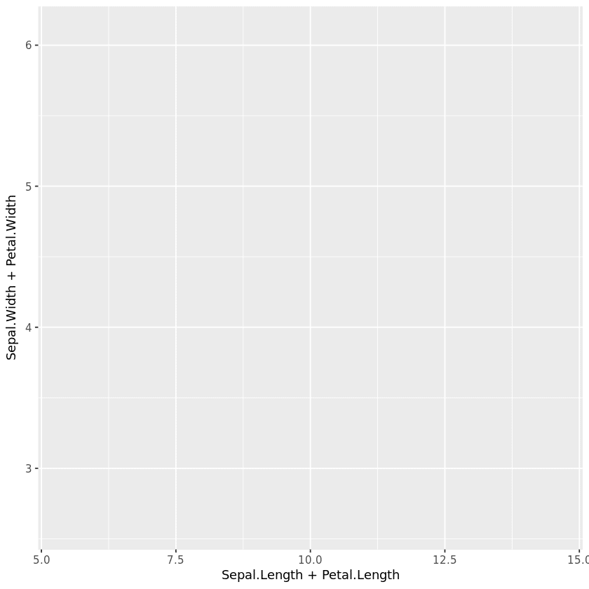
This line creates a ggplot object named p, which represents the iris dataset with the variables Sepal.Length, Petal.Length, Sepal.Width and Petal.Width. The values of Sepal.Length and Petal.Length are added to create the x-axis, while the values of Sepal.Width and Petal.Width are added to create the y-axis.
Step 3: Creating a point cloud
p = ggplot(iris, aes(x=Sepal.Length + Petal.Length, y = Sepal.Width + Petal.Width)) + geom_jitter(aes(color = Species), alpha =0.6, width = 1)
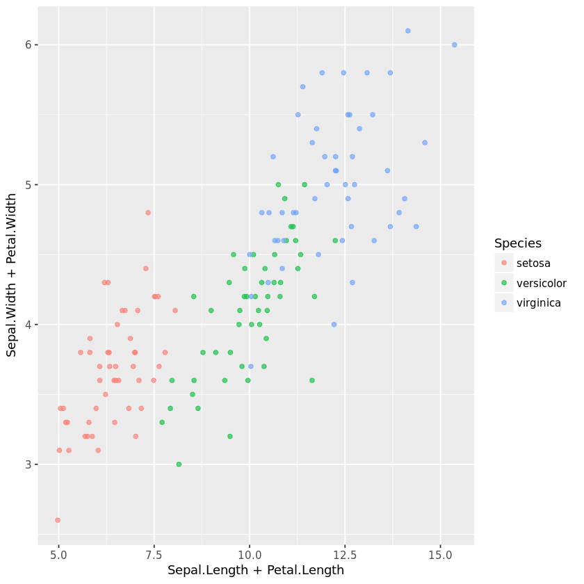
This line adds a point cloud (geom_jitter) to the graph. The points are colored according to the Species variable and have a transparency of 0.6 and a width of 1.
Step 4: Create a linear regression
p = ggplot(iris, aes(x=Sepal.Length + Petal.Length, y = Sepal.Width + Petal.Width))

+ geom_jitter(aes(color = Species), alpha =0.6, width = 1)

+ geom_smooth(method='lm', se = FALSE)
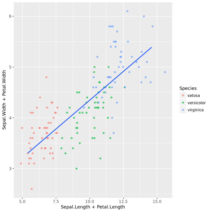
This line adds a regression line layer (geom_smooth) to the graph. The modeling method used is linear regression (method=’lm’). The se = FALSE option is used to avoid displaying confidence intervals.
Step 5: Separate the graph into sub-sections
p = ggplot(iris, aes(x=Sepal.Length + Petal.Length, y = Sepal.Width + Petal.Width))

+ geom_jitter(aes(color = Species), alpha =0.6, width = 1)

+ geom_smooth(method='lm', se = FALSE)

+ facet_wrap(~Species)

This line divides the graph into panels (facet_wrap) according to the Species variable. This allows you to see the relationship between variables for each species separately.
Step 6: Add labels
p = ggplot(iris, aes(x=Sepal.Length + Petal.Length, y = Sepal.Width + Petal.Width)) + geom_jitter(aes(color = Species), alpha =0.6, width = 1)

+ geom_smooth(method='lm', se = FALSE)

+ facet_wrap(~Species)

+ labs(title = "Relation Length/Width", x= "Length", y= "Width")
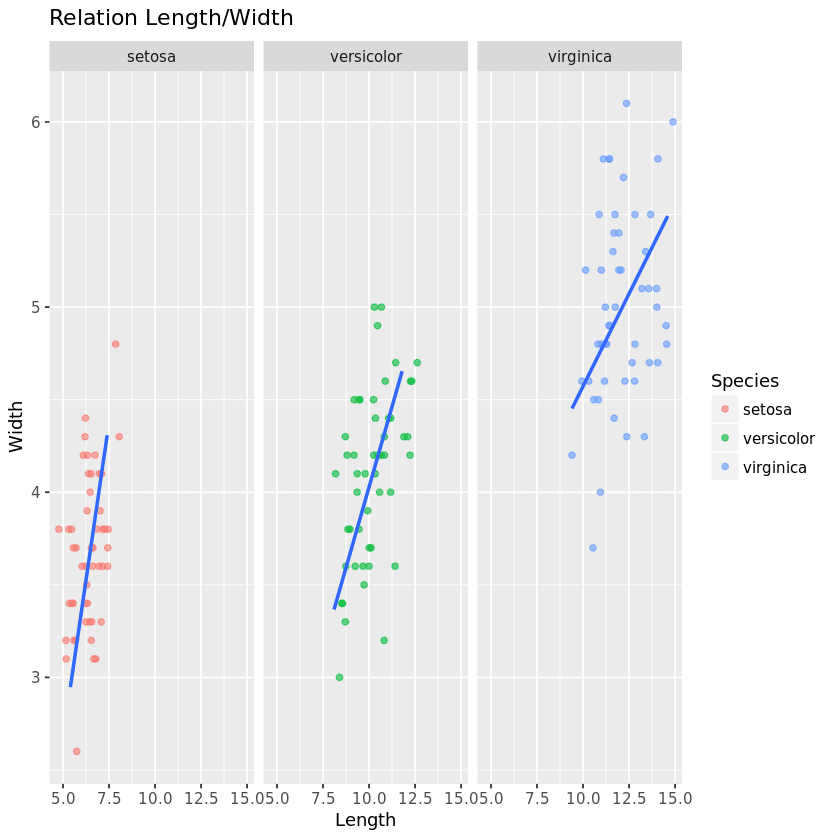
This line adds title and axis labels to the graph. The title is “Relation Length/Width”, the x-axis is labelled “Length” and the y-axis is labelled “Width”.
Step 7: Adding the theme
p = ggplot(iris, aes(x=Sepal.Length + Petal.Length, y = Sepal.Width + Petal.Width))

+ geom_jitter(aes(color = Species), alpha =0.6, width = 1)

+ geom_smooth(method='lm', se = FALSE)

+ facet_wrap(~Species)

+ labs(title = "Relation Length/Width", x= "Length", y= "Width")

+  theme(plot.background = element_rect(fill = '#E8EAF6', color = "#08104E", size = 3))

This line defines a custom theme for the graphic using the theme() function. The argument plot.background is used to define the background of the graphic. The element_rect() function is used to create a rectangle with a fill color of ‘#E8EAF6’, a border color of “#08104E” and a thickness of 3 pixels.
This code creates a 7-step ggplot graph showing the relationship between sepal and petal length and width for different iris flower species. Points are colored according to species, and a linear regression is fitted for each species.
What do I need to know about ggplot?
ggplot is a library for data visualization in R. Thanks to its flexible layering system, we can create complex custom graphics by gradually adding additional graphic components.
If you’re interested in data visualization, don’t hesitate to join our Data Analyst training course!


