Seaborn is a Python Data Visualization tool. Discover everything you need to know: presentation, use cases, benefits, training...
Data Visualization is a technique that allows Data Scientists to transform raw data into graphs and diagrams. Such illustrations make it easier to read and understand data, which is why DataViz is very useful.
There are many “no-code” tools for creating data visualizations, such as Tableau,Power BI, ChartBlocks… However, as an alternative, it’s also possible to choose the Python language.
One of the reasons Python is the best choice for Data Science is its extensive library ecosystem.
Many Python libraries allow data manipulation: numpy, pandas, matplotlib, tensorflow…
While Matplotlib is very popular for creating data visualizations, it can be complex to use. Developers have created a new library based on Matplotlib: Seaborn.
What is Seaborn ?
Seaborn is a library for creating statistical graphics in Python. It is based on Matplotlib and integrates with Pandas data structures.
Complete data frames can be captured, and internal functions for semantic mapping and statistical aggregation allow you to convert data into graphical visualizations.
Seaborn abstracts away all the complexity of Matplotlib. However, it is still possible to create graphics that meet all your needs and requirements.
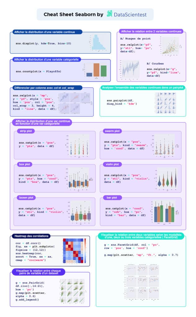
Seaborn provides various default styles and color palettes to create more attractive graphics. Different types of visualizations help highlight relationships between data.
These can involve numerical variables or groups, classes, divisions.
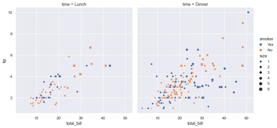
Relational plots are used to understand the relationships between two variables, while categorical plots visualize variables categorized by category.
Distribution plots are used to examine univariate or bivariate distributions. Regression plots add a visual guide to highlight patterns in a dataset for exploratory analysis.
What are the advantages of Seaborn?
The Seaborn library offers several major advantages. It provides various types of visualizations. Its syntax is concise, and it offers very attractive default themes.
It’s an ideal tool for statistical visualization. It is used to summarize data in visualizations and data distribution.
Furthermore, Seaborn is better integrated than Matplotlib for working with Pandas data frames. Finally, it is an extension of Matplotlib to create beautiful graphics using Python through a set of more direct methods.
Matplotlib is primarily used for basic chart plotting, while Seaborn offers many default themes and a wide variety of schemes for statistical visualization.
Additionally, Seaborn automates the creation of multiple figures. This is an advantage, even though it can lead to memory usage issues.
Another strength of Seaborn is its enhanced integration with Pandas and its Data Frames, although Matplotlib is also integrated with Pandas and NumPy.
On the other hand, Matplotlib offers increased flexibility in terms of customization and sometimes better performance. Therefore, it may be a better option in certain situations.
In general, Seaborn is the better choice for statistical data visualization, while Matplotlib is more suitable for customization needs.
Why and how to learn to use Seaborn? DataScientest training courses
Data visualization is widely used in all industries. Therefore, mastering a DataViz tool is a valuable and sought-after skill.
DataScientest’s Data Science training programs allow you to acquire this mastery.
Both Matplotlib and Seaborn are part of the Data Visualization module in our Data Analyst, Data Scientist, and Data Management courses.
Through these programs, you can acquire all the skills required for careers as data analysts, managers, or scientists. In addition to DataViz, you will also learn programming, database handling, as well as Machine Learning and Deep Learning.
Our various training programs take an innovative and beneficial Blended Learning approach, combining in-person and distance learning. They can be done as part of Continuing Education or in a BootCamp format in just a few weeks.
At the end of the program, learners receive a diploma certified by the University of Sorbonne. Among the alumni, 93% found employment immediately after completing the training. Don’t wait any longer and discover our various training programs to learn how to use Seaborn and all the tools of Data Science!