Matplotlib is an open-source Python library for creating data visualizations. Discover everything you need to know: definition, how it works, challenges, and training...
Data visualization is a key step in data analysis. After collecting, storing, and analyzing data, it’s essential to transform the results of these analyses into reports and graphical visualizations. This is because the human brain understands a chart more quickly than a series of statistics in tabular form. Therefore, “DataViz” allows sharing the results of an analysis with non-technical teams within a company, including its executives.
What is Matplotlib ?
Matplotlib is an open-source Python library originally developed by neurobiologist John Hunter in 2002. Its initial purpose was to visualize the brain signals of epileptic individuals. To achieve this, Hunter aimed to replicate the graphic creation capabilities of MATLAB using Python.
Following John Hunter’s passing in 2012, Matplotlib has been continually improved over time by numerous contributors from the open-source community. It is used to create high-quality graphs and charts and serves as an open-source alternative to MATLAB.
For instance, you can create plots, histograms, bar charts, and various types of graphs with just a few lines of code. It’s a comprehensive tool that enables the generation of highly detailed data visualizations.
This library is especially valuable for individuals working with Python or NumPy. It finds application in web application servers, Python shells, and scripts. With Matplotlib’s APIs, developers can also integrate charts into graphical interface applications.
Matplotlib's main concepts
Matplotlib relies on several key elements. A “figure” represents a complete illustration, and each plot within that figure is referred to as an “axis.”
“Plotting” involves creating a graph, for which you need data in the form of key-value pairs representing the X and Y axes. Functions like “scatter,” “bar,” and “pie” are then used to create the chart.
You can create basic graphs like bar charts or histograms, as well as more complex three-dimensional figures using Matplotlib.
4 things you need to know about Matplotlib
With Matplotlib, you can enhance the visual appearance of your graphs by adding a title, legends, and by choosing the style and color of visualizations. You can also adjust the size of the figures and choose the layout of the graphs if you decide to display multiple graphs in a single figure.
Matplotlib also offers a function for annotating graphs freely and for saving an image in jpg format.
Additionally, you can add a digital watermark to a graph to include copyright information.
Now, let’s explore some examples of graphs that you can create with Matplotlib along with the few lines of code to plot them.
1. Tracing functions
Matplotlib is primarily a library for plotting functions and displaying their curves in graphs. We can visualize trigonometric functions like sine and cosine by specifying the interval over which we want to observe these functions.
Here’s an example of plotting the sine and cosine functions between 0 and 6. The function used is `plot()`, which is a basic function in Matplotlib.
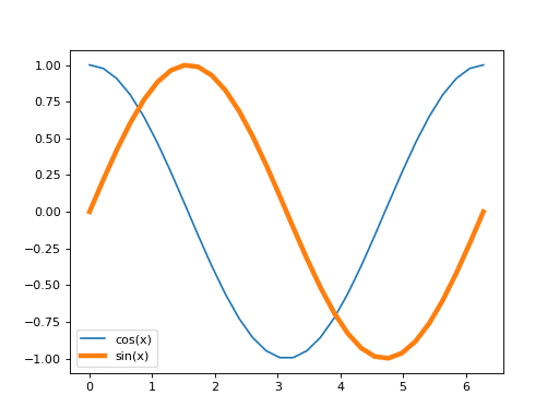
To create this graph, we use two libraries, Matplotlib and NumPy. NumPy is used to calculate the sine and cosine values, and the `arange` function generates a list from 0 to 2 Pi with an interval of 0.1 between each value.
2. Creating 2D Graphs
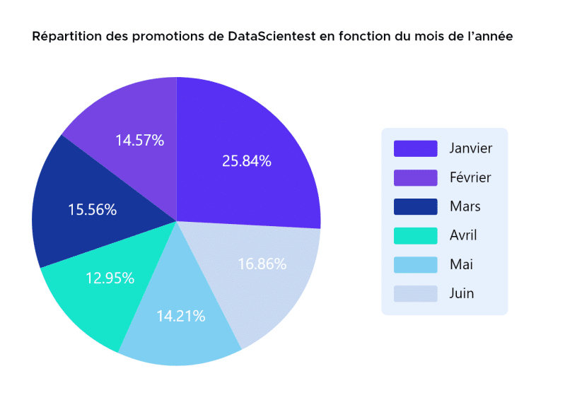
Another feature of Matplotlib is the creation of 2D graphs, which is very useful for a Data Scientist in the data visualization step. Indeed, it is possible to display histograms, pie charts, box plots, scatter plots, stack plots (for stacked data visualization), and more.
These graphs can be used, for example, to display data distribution, statistical indicators, trends over a certain period if dealing with time series data, and more.
The main functions used are:
- hist() to plot a histogram.
- bar() to plot a bar chart.
- pie() to plot a pie chart.
- box() to plot box plots.
- scatter() to plot a scatter plot.
- stackplot() to plot a stacked area chart.
This example is inspired by the “Matplotlib – Box Plots and Pie Charts” module from our Data Scientist and Data Analyst training!
Here, we use the labels, colors, and autopct functions of the pie chart. Labels, as the name suggests, allows you to choose the labels for the segments, colors can be used in various ways, either with keywords like “Yellow” or “Red” or by using Hex codes, as shown in our example.
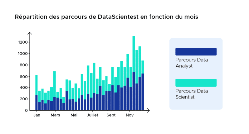
Here, we use two lists, Pda and Pds, which we created beforehand to create our bar chart. First, we create the first bar chart, and then we add the second one by specifying “bottom=Pda” to indicate that the second bar chart is stacked on top of the first one.
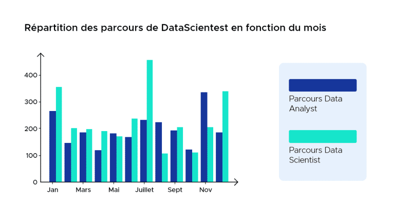
For this bar chart, we decided to place the two bars side by side. To achieve this, we use two sets of values for the X-axis. First, we use “x1,” which ranges from 0 to 11 with a step, and then “x2,” which ranges from 0.4 to 11.4 with a step of 1. We do this to offset the second column by 0.4, which will also be the width of our bars.
These two charts are inspired by the “Matplotlib – Bar Charts” module in the Data Scientist and Data Analyst course.

For this graph, we use lists for the axes. Both groups of scatter plots share the same X-axis but have different values on the Y-axis. We can also see that we use the “s” argument to vary the size of our points.
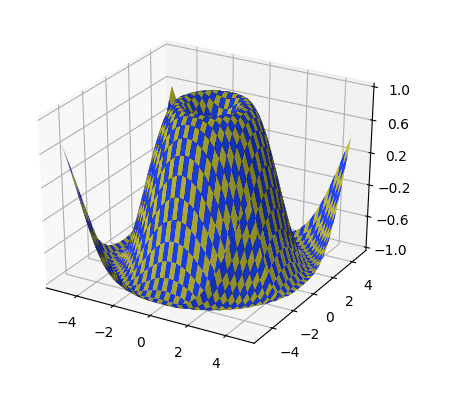
3. Display 3D graphics
It’s also possible to create 3D graphs using Matplotlib. To do this, you need to use a special Matplotlib library called mpl_toolkits.mplot3d (often renamed to Axes3D).
3D graphs can simplify certain visualizations and make a report more enjoyable to read.
In general, the functions used include Axes3D.plot(), Axes3D.scatter(), Axes3D.plot_wireframe(), Axes3D.plot_surface(), and Axes3D.bar().
Here’s an example of what can be displayed using these functions. This example is from the official documentation.
4. Creating widgets
The last feature of Matplotlib that we will discuss is the creation of widgets. These are interactive visualizations on which the user can take action. For a data scientist, this can be very useful, for example, to see how changing a parameter influences a function or a Machine Learning model.
All the necessary classes for implementing a widget can be found in the `matplotlib.widgets` module.
Creating a widget requires creating objects and functions that describe the action of one object on another. Objects could be things like a slider (of the Slider class) or a button (of the Button class), which could, for example, cover a range of values that a function’s parameter might take. Thus, depending on the value of this parameter, the user sees the graph of the function change instantly.
This widget is from the “Introduction to Deep Learning with Keras” module in the Data Scientist and Data Analyst tracks.
By adjusting the parameters w1 and w2, we can adjust the red line to find the boundary that separates the green data from the orange data. This is called a classification problem using a linear method: we separate data into two categories using a linear decision boundary.
What is PyPlot?
Pyplot is a Matplotlib module that offers several simple functions for adding elements such as lines, images, or text to the axes of a graph. Its interface is very convenient, which is why this module is widely used.
There is also an Object-Oriented (OO) API that provides more flexibility and customization by allowing objects to be assembled more freely. However, it is more challenging to use.
Matplotlib, Numpy and Pandas
Numpy is a Python package dedicated to scientific computing. It is an essential dependency for Matplotlib since Matplotlib uses Numpy functions for numerical data and multi-dimensional arrays.
On the other hand, Pandas is a Python library also used by Matplotlib for data manipulation and analysis. It is not an essential dependency like Numpy, but it is often used in conjunction with Matplotlib.
Matplotlib and Data Science
Python is the most widely used programming language for Data Science and Machine Learning. As a result, resources like NumPy and Matplotlib are very valuable for building machine learning models.
Programmers can access these libraries to perform crucial tasks within the Python environment. It is then possible to integrate the results with other elements and functionalities of a machine learning program or neural network.
What are the difficulties with Matplotlib?
Learning Matplotlib can be challenging. There are many tutorials available, but several difficulties may arise for beginners.
Firstly, this library is extremely extensive, comprising over 70,000 lines of code in total. It also hosts multiple different interfaces and has the capability to interact with various backends for rendering graphics.
Moreover, while publicly accessible documentation on Matplotlib is understandable, some documents are simply outdated. This tool continues to evolve over time, and some examples available on the internet can actually be achieved with 70% fewer lines of code on modern versions.
How do I learn Matplotlib?
Matplotlib offers many possibilities for data visualization but can be challenging to master due to its technical complexity and heavy syntax. Learning it on your own can be difficult because much of the online documentation is outdated.
To learn how to use this library effectively, you can consider DataScientest’s training programs. We offer courses that cover various roles in data science, including Data Analyst, Data Scientist, Data Engineer, ML Engineer, and Data Manager.
Python is the preferred programming language for all our programs, and you will learn to use this language and its various data science libraries, including Matplotlib for data visualization. This tool is part of the curriculum in our “data visualization” module for Data Analyst, Data Scientist, and Data Management training programs.
All our training programs follow a Blended Learning approach, combining an online platform with coaching and in-person masterclasses. They can be completed through Continuous Training or in an intensive BootCamp format in just a few weeks.
Upon completion of these programs, learners receive a diploma certified by the University of Sorbonne and can quickly enter the job market. Over 90% of our graduates secure employment after their training.
Therefore, DataScientest is the best way to learn how to master Matplotlib, Python, and various data science resources. Don’t wait any longer and explore our training programs today.
Conclusion
Matplotlib allows you to create a wide variety of visualizations, but there are other libraries that can also create impressive visuals. Some of these libraries include Seaborn, Bokeh, and Ggplot, among others.
Data visualization is at the core of all the challenges addressed by Data Scientists and Data Analysts. To learn how to master these techniques, several modules are dedicated to Matplotlib, Bokeh, and Seaborn in our Data Scientist and Data Analyst training programs.


