The role of a Data Analyst revolves around the effective utilization of data to glean insights that inform decision-making. To accomplish this, it’s crucial to be proficient with various tools that cover the different phases of the analysis cycle (or pipeline): extraction, exploration, transformation, visualization, and sharing.
In this article, we present 7 categories of essential tools for data analysts, with alternatives provided based on context or preferences. Whether you’re currently in the position or transitioning into it, this overview will help you structure your toolbox.
1. Programming Language: Python (primary) and R (alternative)
Any serious Data Analyst begins by selecting their preferred programming language. Python is currently the favorite in the data industry: it’s a versatile language widely adopted by many Data Analysts (among others). With its clear and readable syntax, Python is famous for being easy to learn and highly versatile. It also sports an extensive library ecosystem (pandas for data manipulation, NumPy / SciPy for computations, scikit-learn for ML, etc.), making it suited for nearly all tasks faced by a Data Analyst. It’s essentially the Swiss Army knife for data.
Python also includes Jupyter Notebook (and the newer JupyterLab), which is arguably the most renowned notebook interface. As an open-source web application, it allows you to combine code, visualizations, equations, and text in one document. You can write Python code, view resulting graphics instantly on the page, annotate with explanations among the cells, then save everything in a single .ipynb file for export in various formats (pdf, docx, html…). Jupyter supports over 40 languages (with an emphasis on Python) and is used for quick prototyping and showcasing results.
As an alternative, R comes to mind, with its enduring popularity within the data community. Through its tidyverse packages (dplyr, ggplot2, etc.), R excels in statistical analysis and high-quality graphic creation. R could be preferable if your environment is deeply statistical (academia, research) or if your team is already proficient in the language. In conclusion, Python and R are often on equal footing: Python generally leads in commercial settings (ML, automation, big data), while R excels in pure analysis and sophisticated visualizations.
2. Data Visualization Tool (dataviz): Matplotlib (primary) and ggplot2 (alternative)
Once the coding and data are ready, visualization of the results is necessary. In Python, Matplotlib is the classic go-to library for visualization (2D). It enables plotting all types of charts (lines, histograms, bars, scatter plots, etc.) with extensive appearance customization (titles, legends, colors). For example, Matplotlib generates quality plots suitable for any format and environment. In practice, it’s often employed via its pyplot interface to swiftly generate a line graph for sales trends over time or a histogram of variable distribution. For more visually appealing and modern graphs in Python, Seaborn and Plotly are alternatives, though Matplotlib remains the robust and indispensable foundation.
In R, the go-to is ggplot2, employing the famous Grammar of Graphics. You start with ggplot() and apply geometry layers (geom_point, geom_line, etc.), color them, add facets, allowing you to develop intricate visuals in a structured and modular approach. For instance, ggplot2 allows you to overlay a colored scatter plot with a regression curve effortlessly and divide the same graph between two subgroups using a facet. The power of ggplot2 lies in its graceful logic and default aesthetic presentation. Additionally, other tools like Datawrapper exist for dataviz, yet both Matplotlib and ggplot2 remain the preferred programmatic bases for beginner and intermediate analysts.

3. ETL / Data Manipulation Tool: Pandas (primary) and KNIME (alternative)
A significant portion of a Data Analyst’s job is preparing data: cleaning, filtering, transforming, aggregating… For this, data manipulation libraries become our trusted tools. In Python, the gold standard is Pandas, a library providing the DataFrame type, a tabular data structure replete with methods for data processing: filtering, joining (merge), sorting, groupby, pivoting, handling missing values, etc. For example, a Data Analyst might load several CSV files, concatenate them, execute statistical operations, and render data ready for analysis with just a few Python commands. Pandas stands as the default choice for data cleaning in Python scripts.
As an alternative (especially in no-code/low-code scenarios), platforms like KNIME Analytics Platform are available. KNIME is an open-source ETL software that functions by dragging and dropping “data nodes.” As KNIME describes, its platform supports powerful, scalable, and repeatable ETL processes. Practically, an analyst can, without writing code, retrieve diverse inputs (Excel, SQL database, Web API), then drag modules to filter, aggregate, join, clean, and ultimately export to other applications (like sending results to Power BI or a database). It’s particularly handy for those who favor a visual interface, providing an intuitive flow diagram for data handling, facilitating the management of large datasets or creating reusable pipelines. In such cases, KNIME or similar tools like Alteryx/Power Query might be preferred for quickly constructing ETLs without lengthy coding.
4. Dashboarding Tool: Power BI (primary) and Tableau (alternative)
Towards the close of the analytics pipeline, results often need to be shared via an interactive dashboard or visual report. Microsoft Power BI leads in this domain, connecting directly to Excel, Azure, SQL Server, and numerous other sources. It processes data via its Power Query engine before visualization. As per the renowned Gartner Magic Quadrant, Power BI is currently the best BI solution. Its distinguishing features include a more accessible pricing model (even free for smaller volumes) and compatibility with numerous services, particularly its seamless integration into the Microsoft ecosystem.
An equally robust BI alternative is Tableau. Founded in 2003, Tableau has established itself as a “powerful and popular data visualization tool.”
Its asset: highly refined visualizations and advanced capabilities (view calculations, recent AI integration). Nevertheless, Tableau can seem complex initially and is relatively costly (without a free version). It is preferred in scenarios with adequate company budgets, a necessity for highly customized, professional visuals, and a discerning audience (senior executives, VIP clients).

To sum up, Tableau provides sophistication and visual variety for demanding BI needs, while Power BI focuses on accessibility and Office 365 integration. Examination of both is advisable based on context: cost considerations, team expertise, and technical requirements will guide your decision.
5. Database Management System (DBMS) & SQL
The Database Management System is an essential tool for the Data Analyst, facilitating data storage and acting as the initial phase in a Data Analyst’s pipeline. While Data Analysts may not have the liberty to select the database they’re working with (PostgreSQL, MySQL, Oracle, etc.), mastering SQL is non-negotiable. It’s the gateway for extracting, filtering, and aggregating data across the majority of enterprises. Even within cloud or big data contexts, SQL variants are invariably present.
Alternative: SQL + ORM (via Python or R)
If you lean towards coding, libraries like SQLAlchemy (Python) can be used to interact with databases through code rather than raw SQL, though this convenience doesn’t replace a solid comprehension of SQL.
6. Versioning / Collaboration Tool: Git + GitHub
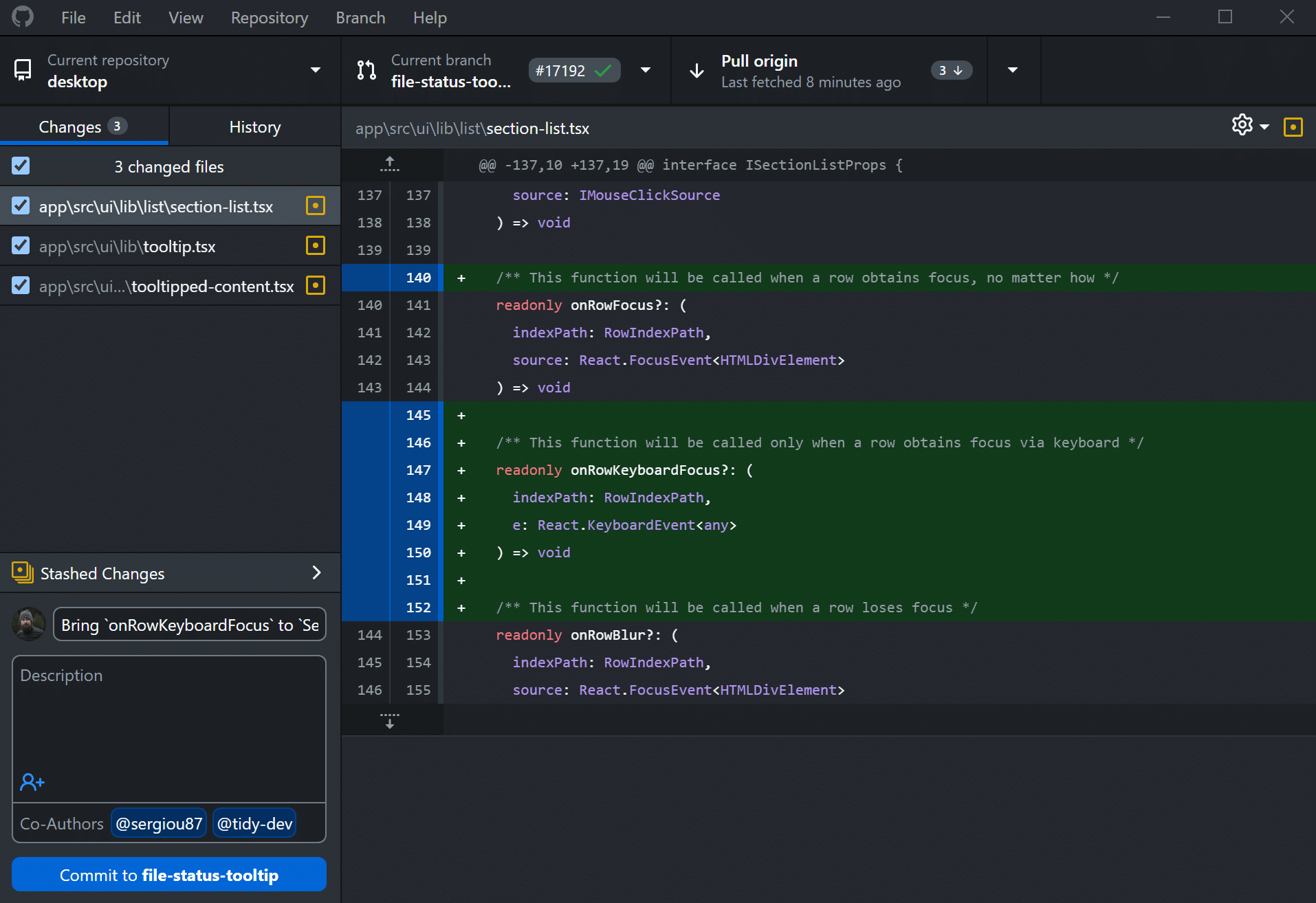
It’s crucial not to overlook collaboration and versioning. An analyst who codes (Python/R scripts, notebooks, SQL queries) needs capabilities for tracking changes and team collaboration. Git is the leading open-source version control system. It’s employed to keep a historical track record of each code file: every commit logs a modification, facilitating rollbacks when needed. Git is designed for speed and to handle small or large projects with robust features (affordable local branching, staging, and more). Most intermediate Data Analysts utilize Git via the command line or through lightweight GUI clients (like GitHub Desktop).
Built upon this, collaborative platforms exist. The most prominent is GitHub, a web-based code hosting service grounded on Git. GitHub positions itself as “a hosting service allowing programmers to share and collaborate on project code.” Millions of developers use it to collaborate: creating repositories, uploading notebooks, initiating pull requests for code reviews, etc. For a Data Analyst, GitHub facilitates collaboration (sharing analyses, accessing colleagues’ work, managing feedback) and frequently acts as a professional portfolio.
7. Rapid Analysis and Prototyping (Excel)
Understanding: Excel
Despite the emergence of specialized tools, Excel remains an indispensable asset in many organizations. Its intuitive approach, calculation capabilities, pivot tables, and visualization tools make it an excellent choice for rapid exploratory analyses, prototyping, or ad-hoc reports. It is frequently the entry or exit point for business data workflows.
Alternative: Google Sheets
Though less powerful for handling large data volumes, it’s inherently collaborative and available online. Ideal for distributed teams or for easily sharing simple tables. There’s a growing selection of connectors and automations that link Google Sheets with cloud tools or APIs.
Conclusion
In summary, a competent Data Analyst possesses a well-oiled toolbox that is both adaptable and complementary. We’ve delved into seven critical categories:
- A programming language (primarily Python, with R as an alternative) to orchestrate analyses.
- A data visualization tool (Matplotlib vs ggplot2) to explore and present data visually.
- An ETL/transformation tool (pandas vs KNIME) to clean and prepare raw data.
- Expertise in at least one DBMS and SQL for efficient data storage and querying of large structured data volumes.
- A dashboarding tool (Tableau or Power BI) for crafting impactful visual reports.
- A versioning/collaboration tool (Git/GitHub) for tracking code versions and enabling teamwork.
- A prototyping tool (Excel) for swiftly creating simple models and visualizations.
Each tool boasts its own strengths: simplicity, power, flexibility, or cost-effectiveness. The goal isn’t to master them all simultaneously, but to be knowledgeable in at least one tool within each category. Equipped with this knowledge, an intermediate-level analyst can smoothly navigate various projects and technologies: they’ll possess the correct key for every data lock, whether tackling a brief exploratory script or a more extensive industrial pipeline. Therefore, don’t hesitate to experiment with these tools, discover those most suited to your circumstances, and most importantly, maintain a curious mindset (and a hint of light-heartedness) on this data journey!


