
Power BI matrix table: Matrix visualization is a very useful feature of Power BI, especially for text analysis. Find out everything you need to know, and how to take a training course to master the software.
Multivariate reporting is often a necessity in Business Intelligence. It is sometimes essential to visualize data in different dimensions.
Tabular visualization is particularly important when analyzing a text category or a textual data set. With Excel, this is made possible by pivot tables. Power BI, on the other hand, enables matrix visualization.
With an ordinary two-dimensional Power BI table, the data presented is flat, and duplicate values are displayed without being aggregated. In contrast, a matrix table supports multiple dimensions, a layered layout, aggregated data, and offers drill-down functionality.
Multiple variables can be specified in rows and columns. This type of visualization chart enables categorical variables and text labels to be displayed in a report.
What is Power BI?
Power BI is Microsoft’s Business Intelligence software. This tool enables you to analyze and visualize data, in order to present usable information.

The platform combines business analysis and data visualization functionalities to enable companies to make data-driven decisions.
Interactive dashboards and reports can be built from data from a variety of sources. A variety of charts and graphs can be used to visualize data.
Power BI can access vast volumes of data from multiple sources, in a wide variety of formats such as Excel, CSV, XML, JSON or PDF. Its powerful compression algorithms enable data to be imported as .PBIX files.
The tool also boasts a highly intuitive drag-and-drop user interface. Integration with Excel and Office 365 ecosystem software is also a major highlight.
Considered the benchmark in Business Intelligence software, Power BI is used by companies in all sectors for business intelligence and data analysis.
What is Power BI matrix table / matrix visualization?
A matrix display is similar to a table. However, a table supports two dimensions and the data is flat. Duplicate values are displayed, not aggregated.
The matrix simplifies the display of multi-dimensional data thanks to a tiered layout. Data is automatically aggregated, and a drill-down feature allows for further analysis.
Matrix visuals can be created in Power BI reports, and elements within the matrix can be highlighted with other visuals on that report page.
For example, rows and columns or even individual cells can be selected and highlighted. Selections of individual cells or multiple cells can be copied and pasted into other applications.

How do I create a Power BI matrix table?
Power BI matrix tables are just as easy to create as conventional tables. All you have to do is fill in the rows, columns and values.
For example, if you want to create a table grouping the year’s sales, the store chain, its geographical zone and its product category, you can place the store chains and zones in the rows, the product categories in the columns, and the year’s sales values.
First click on the matrix table icon in the viewer panel, then drag the appropriate fields to the right positions.
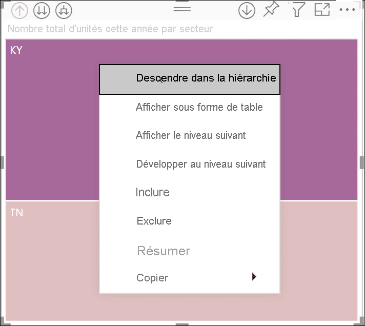
Drill Down functionality
Power BI offers a useful “Drill Down” functionality for matrix visualization. It can be used on rows, columns, individual sections or even cells.
To drill down rows and columns, it’s necessary to start by adding multiple fields to row and column buckets on the visualization panel.
This creates a hierarchy or grouping. For example, store chain and product category fields can be placed in the row bucket. The drill down / drill up icons in the top left corner indicate whether the matrix table has a hierarchy.
Formatting options
Power BI offers numerous formatting options for matrix visuals. Simply click on “format” on the visualization panel while the visual is selected.
These include formats for grids, column and row headers, values, totals and subtotals, and fields. A conditional formatting option is also available to display data bars according to cell value.
How do I take a Power BI training course?
Multivariate reporting is commonly used in Business Intelligence, and knowing how to create matrix visualizations is a valuable skill in demand in the enterprise. To master Power BI and all its subtleties, you can choose DataScientest.
Our Power BI distance learning BootCamp course enables you to acquire complete mastery of the software in just five days. By the end of the course, you’ll be able to analyze data and create interactive dashboards with Power BI.
The program covers the Power Query engine, the DAX language and DataViz. As a Microsoft Learning Partner, DataScientest prepares you to take the Microsoft PL-300 exam for Power BI Data Analyst Associate certification.
This state-recognized training course can be fully financed by different funding options. Don’t wait any longer and discover DataScientest’s PowerBI training!
Now you know all about matrix visualization in Power BI. For more information, see our complete dossier on Power BI and our dossier on Excel.


