
The Power BI waterfall chart is a type of DataViz that visualizes changes between an initial value and a final value. Find out all you need to know about this graph: presentation, benefits, tutorial, training…
To visualize data, bar and column charts are ideal for initial and final values. However, this type of diagram doesn’t allow you to detail all the factors that led to the final value.
Fortunately, Microsoft’s Power BI software offers an ideal format for this type of DataViz: the waterfall chart.
What is a Power BI waterfall chart?
In nature, a waterfall very rarely flows in a perfectly steep, uniform manner. Before reaching the river, waterfalls pass through the hollows and reliefs of the eroded cliff.
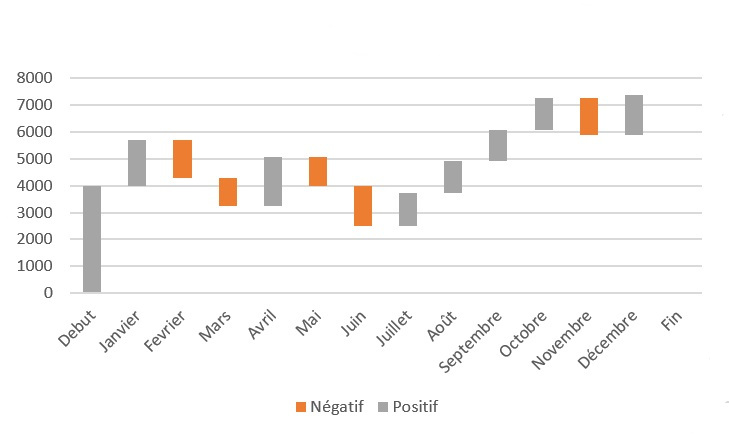
The same applies to the data passing from an initial value to a final value. That’s why the Power BI waterfall chart has such a colourful name, as it shows each individual component contributing to the final value.
A start bar represents the initial value, and begins from a baseline of zero. Two bars then appear to float in space: these are the transient values representing positive and negative changes to this starting value.
These changes can be time-based or category-based. Finally, the end bar represents the final value, taking into account the effects of all the transient values displayed.
The cascade chart is sometimes nicknamed the bridge chart, as it allows you to quickly spot value rises and falls thanks to the colors of the columns.
Power BI waterfall charts and bar charts: what's the difference?
The waterfall chart is generally used for very specific use cases. Only some users use this type of diagram on a regular basis.
At first glance, many people confuse the waterfall diagram with a bar or column diagram. But the difference is quite simple.
A bar or column chart visualizes the total value of a measurement in each category using bars. Each bar has a zero baseline.
A waterfall diagram, on the other hand, shows positive and negative changes in a value. It therefore comprises a start bar and an end bar, each with a zero baseline.
Each floating bar in the middle has the end of the previous bar as its baseline. This baseline can start at the top or bottom, depending on whether the bar represents a positive or negative change.
When to use a Power BI waterfall chart?
The waterfall diagram is used for very specific use cases, notably in finance. When it comes to visualizing changes in value, there’s really no alternative to the Power BI waterfall chart.
In particular, this type of DataViz is used for financial analysis and profit and loss statements. Generally speaking, this diagram allows you to visualize any cumulative value and its changes.
It is used to visually represent how a starting value becomes a final value through a series of intermediate operations, expenses and the balance of a bank account, to illustrate a company’s headcount at the beginning and end of the year, or to show changes or variance in various categories.
What are the components of a waterfall chart?
To add data to a Power BI waterfall chart, you need to fill in various fields. The category is represented by the horizontal axis, and specifies the columns dividing the chart.
Breakdown is used to specify the columns dividing the detailed data. Finally, values are used to specify the measurement columns represented by the vertical axis.

Advantages and disadvantages of the Power BI waterfall chart
The Power BI waterfall chart offers several major advantages. It’s easy to create, requires no special data preparation, uses a clear structure and effectively displays progressive changes over time. This chart is ideal for tracking a company’s performance over time.
On the other hand, customization options for this chart are limited. Nor is this form of DataViz suitable for detailed data analysis, since it is not possible to extend the data or make a selection.
Power BI waterfall charts: tips and tricks
As with any type of DataViz, it’s important to use colors to tell a story through the waterfall diagram. In particular, you can use different colors for negative and positive values, and a third color for initial and final totals.
To improve readability, you can also add connecting lines between each value. This avoids confusion between start and end values if they are close together, guiding the user’s eyes.
You can also use Power BI’s formatting features, adding legends and labels. Filter and variance options are also invaluable.

How to create a waterfall chart from Excel?
As an example, here’s how to create a Power BI waterfall chart from Excel data. Start by downloading a sample of Excel data from the browser, or preparing it as required.
On Power BI Deskstop, go to “Get Data” and then Excel to select your data. Then click on “Open”, and select the data on the browser page that appears.
To transfer the data from the browser to Power BI, click on “Upload”. You can check whether the transfer is successful by selecting the Data section on the left-hand side of the screen.
The data is now ready for viewing. Go to the report section to create a waterfall chart from the data. Complete the category, breakdown and value fields.
How to master Power BI
The waterfall graph is just one of the many DataViz features in Power BI. This formidable tool not only offers a wide range of visualization options, but also the ability to analyze data from multiple sources to generate reports and dashboards.
The Power BI platform is increasingly used in business, and mastering it is a sought-after skill. To acquire this expertise, you can choose DataScientest.
Our Power BI certification course enables beginners to master the software in just 38 hours spread over five days. Depending on your level, you can also choose to get started in three days, or to study only the more advanced functions over two days.
This course covers not only DataViz, but also the Power Query search engine and the DAX language. By the end of the course, you’ll be able to harness the full power of Power BI.
As a Microsoft Learning Partner, DataScientest prepares and administers the Microsoft PL-300 certification exam. Successful completion of this exam leads to Power BI Data Analyst Associate certification.
This training is entirely distance learning via the Internet, and can be financed via different funding options. Don’t wait any longer, and discover DataScientest to learn how to use Power BI!


