
That's it! The dataset has been cleaned! No more missing values, the modelling choices have been made! We've kept some variables and deleted others. Now we need to carry out the final step before running the Machine Learning algorithms: adapting the variables to the algorithm.
Most Machine Learning algorithms do not allow the use of non-numerical variables: apart from decision trees and their derivatives (random forests, gradient boosting trees, etc.), the most widely used Machine Learning algorithms are based on distance calculations between different observations.
In this article, we will look at how to prepare the data in order to supply it to a Machine Learning algorithm and attempt to justify this.
Preparing a quantitative variable
When we use Machine Learning, we very quickly come across quantitative variables: the age of a customer, the price of a car, the surface area of a plot of land… In the end, there is very little difference between a discrete variable and a continuous variable: the transformations we apply to them have no impact on the quality of the information they contain.
To prepare a quantitative variable, we use a standard or min-max normalisation. This normalisation brings the values into a standard interval: from 0 to 1 for the min-max and between -1 and 1 for most of the data for the standard.
While one of the main functions of data normalisation is to improve and accelerate the convergence of algorithms based on gradient descent (SVM, regressions, etc.), it can also be used to provide more relevant results in the context of clustering: in the following example, we generate random data by trying to define fairly visual clusters and slightly more outlier data. We then run a KMeans with or without normalisation:
					import numpy as np
import pandas as pd
from sklearn.preprocessing import StandardScaler, MinMaxScaler
from sklearn.cluster import KMeans
import matplotlib.pyplot as plt
%matplotlib inline
a = np.random.normal(size=100)
a[:50] = a[:50] + 100
a[50] = a[50] + 60
a[51] = a[51] + 40
b = np.random.normal(size=100)
b[25:75] = b[25:75] + 10
b[51] = b[51] - 10
df = pd.DataFrame({'a': a, 'b':b})
df_standard = df.copy(deep=True)
df_minmax = df.copy(deep=True)
df['cluster'] = KMeans(n_clusters=4).fit_predict(df)
df_standard[df_standard.columns] = StandardScaler().fit_transform(df_standard)
df_standard['cluster'] = KMeans(n_clusters=4).fit_predict(df_standard)
df_minmax[df_minmax.columns] = MinMaxScaler().fit_transform(df_minmax)
df_minmax['cluster'] = KMeans(n_clusters=4).fit_predict(df_minmax)
fig, axes = plt.subplots(ncols=3, nrows=2, figsize=(15, 10))
axes[0, 0].scatter(df['a'], df['b'], color='b', alpha=.5)
axes[0, 1].scatter(df_standard['a'], df_standard['b'], color='b', alpha=.5)
axes[0, 2].scatter(df_minmax['a'], df_minmax['b'], color='b', alpha=.5)
axes[0, 0].set_title('No scaler')
axes[0, 1].set_title('Standard scaler')
axes[0, 2].set_title('MinMax scaler')
The result is a figure similar to this one:
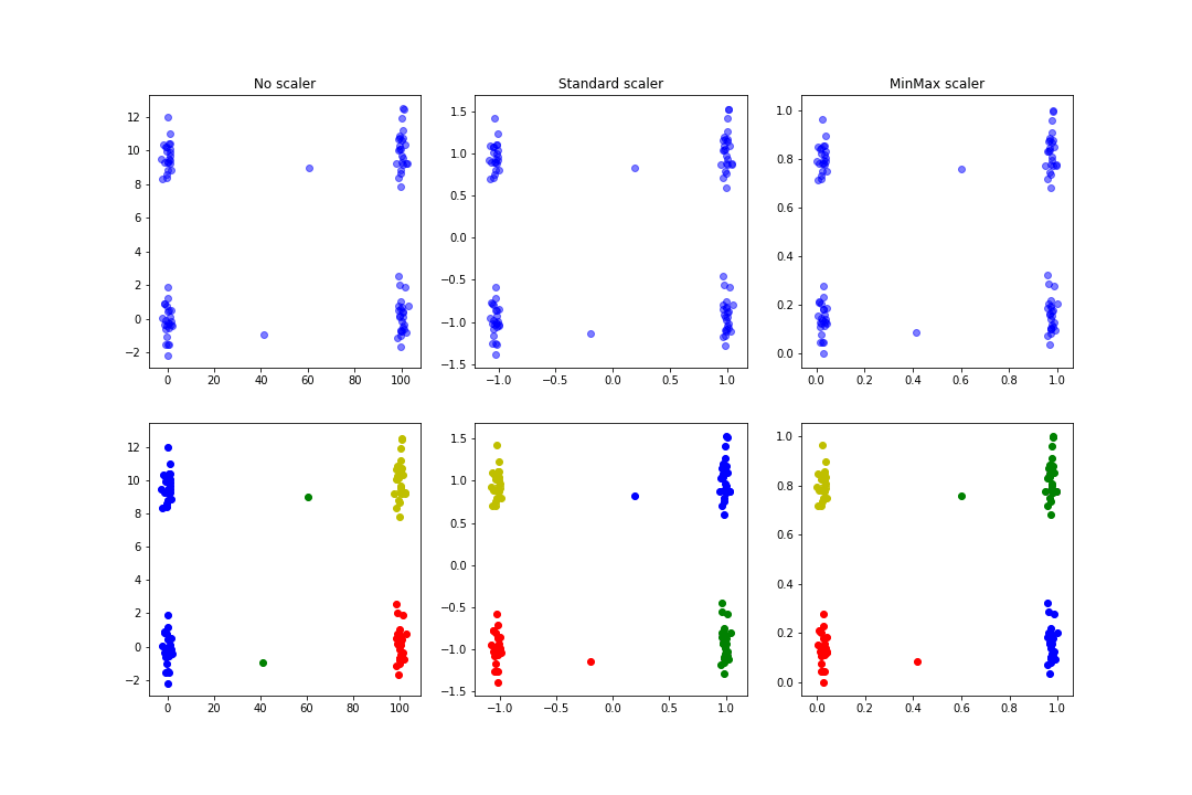
We can see that the clusters found in the normalisation case are more logical than in the pre-normalisation case.
The main difference between standard normalisation and min-max normalisation is in the cases where extreme values are found. Standard normalisation assumes a normal distribution of the variable to bring the values between -1 and 1 for the majority. In the following example, the variable b has some extreme values. Note that normalisation does not bring the values back to this interval:
					a = np.random.normal(loc=0, scale=2, size=1000)
a[:500] = a[:500]
b = a.copy()
b[:20] = b[:20] + 10
df = pd.DataFrame({'a': a, 'b': b})
df_standard = df.copy(deep=True)
df_minmax = df.copy(deep=True)
df_standard[df_standard.columns] = StandardScaler().fit_transform(df_standard)
df_minmax[df_minmax.columns] = MinMaxScaler().fit_transform(df_minmax)
fig, axes = plt.subplots(nrows=2, ncols=3, figsize=(20, 15))
axes[0, 0].hist(df['a'], bins=100, color='b')
axes[0, 1].hist(df_standard['a'], bins=100, color='r')
axes[0, 2].hist(df_minmax['a'], bins=100, color='g')
axes[0, 0].set_title('No scaler')
axes[0, 1].set_title('Standard scaler')
axes[0, 2].set_title('MinMax scaler')
axes[0, 0].set_ylabel('a')
axes[1, 0].set_ylabel('b')
axes[1, 0].hist(df['b'], bins=100, color='b')
The result is a figure similar to this one:
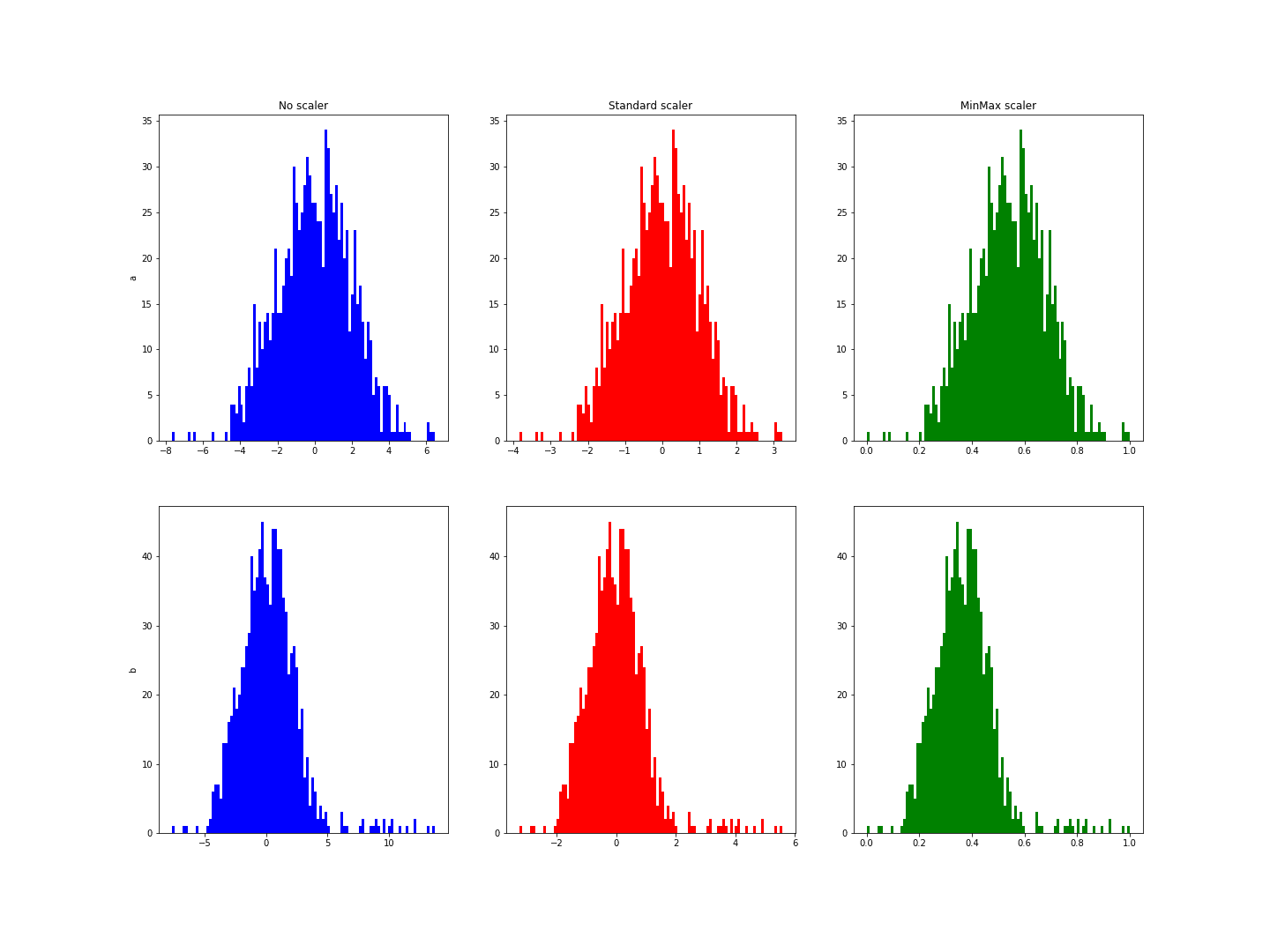
These histograms show a range from -3 to 6 for variable b, whereas it was from -3 to 3 for a.
Obviously, in both these cases, we have deliberately added outliers to force the line. In a Data Science project these values would have been removed earlier, but these examples give an idea of what normalisation can do for quantitative variables.
Preparing a qualitative variable
As we said earlier, Machine Learning algorithms do not take non-numerical variables as input (at least not for Python and scikit-learn). The data must therefore be transformed. Here again, we need to distinguish between several cases.
If there is a clearly established hierarchy between the different modalities, then we can no doubt reduce ourselves to a quantitative variable: for example, if one of our variables is a grade from A to F, then we should be able to reduce these grades to values between 0 and 20 with F < E < D < C < B < A. If we are interested in products available on an e-commerce site, new could be worth 20, good condition 15, fair 10, damaged 7, … In this case, all we have to do is refer to the previous paragraph.
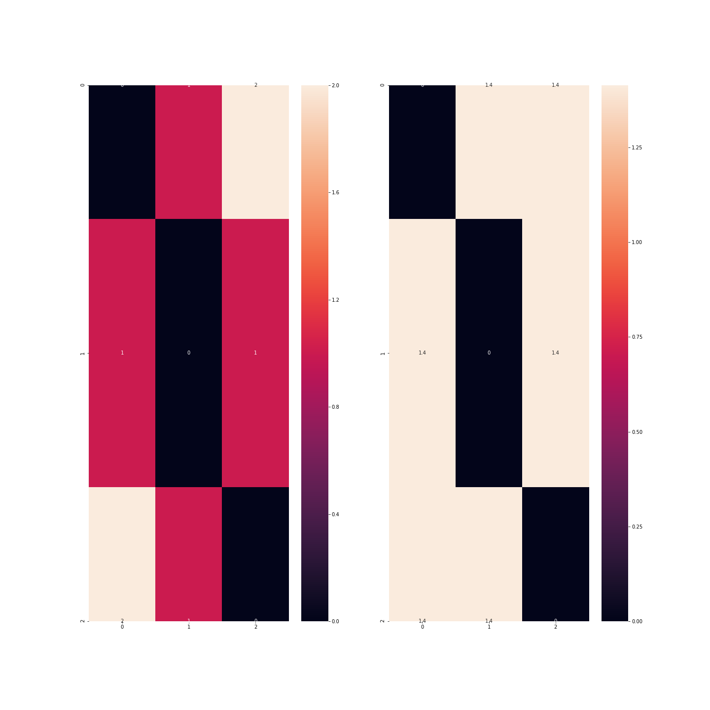
But if there is no hierarchy, what’s the problem with using the same kind of signature? If, for example, I consider a dataset of car models and we have the colour variable with three modalities (let’s say blue, red and green): if I assign codes 0, 1 and 2 to the colours, then I realise that blue < red < green, which is quite debatable! What’s more, mathematically, this would mean that blue + blue = blue, which so far is fairly accurate, but also that blue + red = red, which is starting to get rather annoying, and finally, red + red = green, which is only true in the case of colour blindness! Another problem raised is that the difference between blue and green is twice as great as between blue and green, which again is debatable.
					df = pd.DataFrame({'couleur': ['bleu', 'rouge', 'vert']})
# encoder avec 0, 1, 2
code = {'bleu': 0, 'rouge': 1, 'vert': 2}
df_1 = df.copy(deep=True)
df_1['couleur'] = df_1['couleur'].apply(lambda c: code.get(c))
print(df_1.head())
from scipy.spatial import distance_matrix
import seaborn as sns
print('\nMatrices de distance')
plt.figure(figsize=(20, 20))
sns.heatmap(distance_matrix(df_1, df_1), annot=True)
plt.show()
In this example, we can see that the distance is greater between observations corresponding to the colours blue and green than between observations corresponding to the colours blue and red or red and green.
We therefore need to binarise the data: each modality will be transformed into an indicator variable: instead of having one variable, we will have 3, each with 0s and 1s: in the red column, only observations corresponding to red vehicles will be worth 1…
					df_2 = df.copy(deep=True)
df_2 = pd.get_dummies(df_2)
print(df_2.head())
print('\nMatrices de distance')
plt.figure(figsize=(20, 20))
sns.heatmap(distance_matrix(df_2, df_2), annot=True)
plt.show()
There is, however, one point to which we must return in this story: if we take as many columns as there are modalities, then the information contained in my dataset is redundant.
We can therefore do without one of these categories because it is implied by the others, which will then all be zero: this technique makes it possible to reduce the size of the dataset but above all to remove a variable that is too correlated with the others: If there are many modalities, then most of the indicators for these variables will be zero for many observations and they will all be zero at the same time.
But we still have one category to discuss: circular variables.
Preparing a circular variable
A circular variable is a quantitative or qualitative variable which loops back on itself: the months of the year, the time of day, the seasons, the life stage of a product which can be recycled ad infinitum, etc.
What’s special about these variables is that we can define a hierarchy between the different values, but that this hierarchy is circular: 1am would be greater than 0am in the same way that 0am would be greater than 11pm; similarly, spring < summer < autumn < winter < spring < …
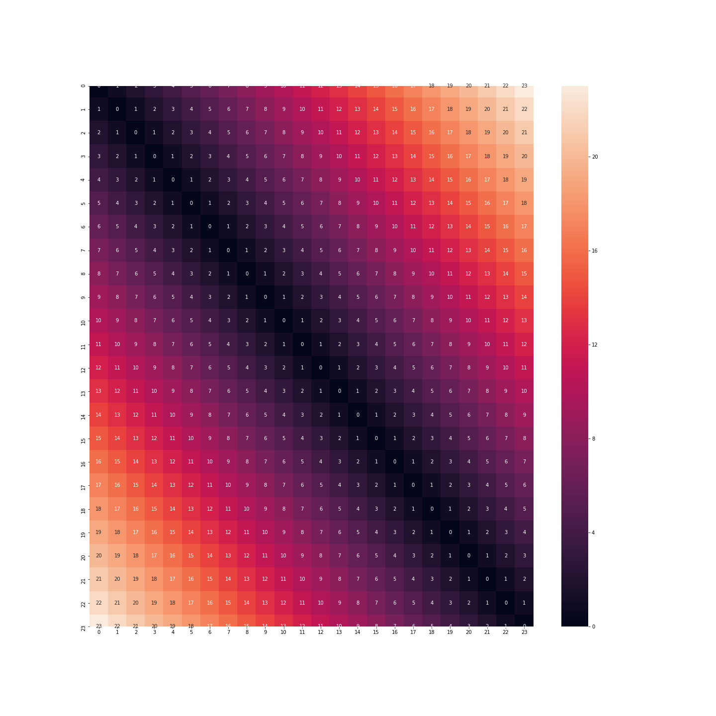
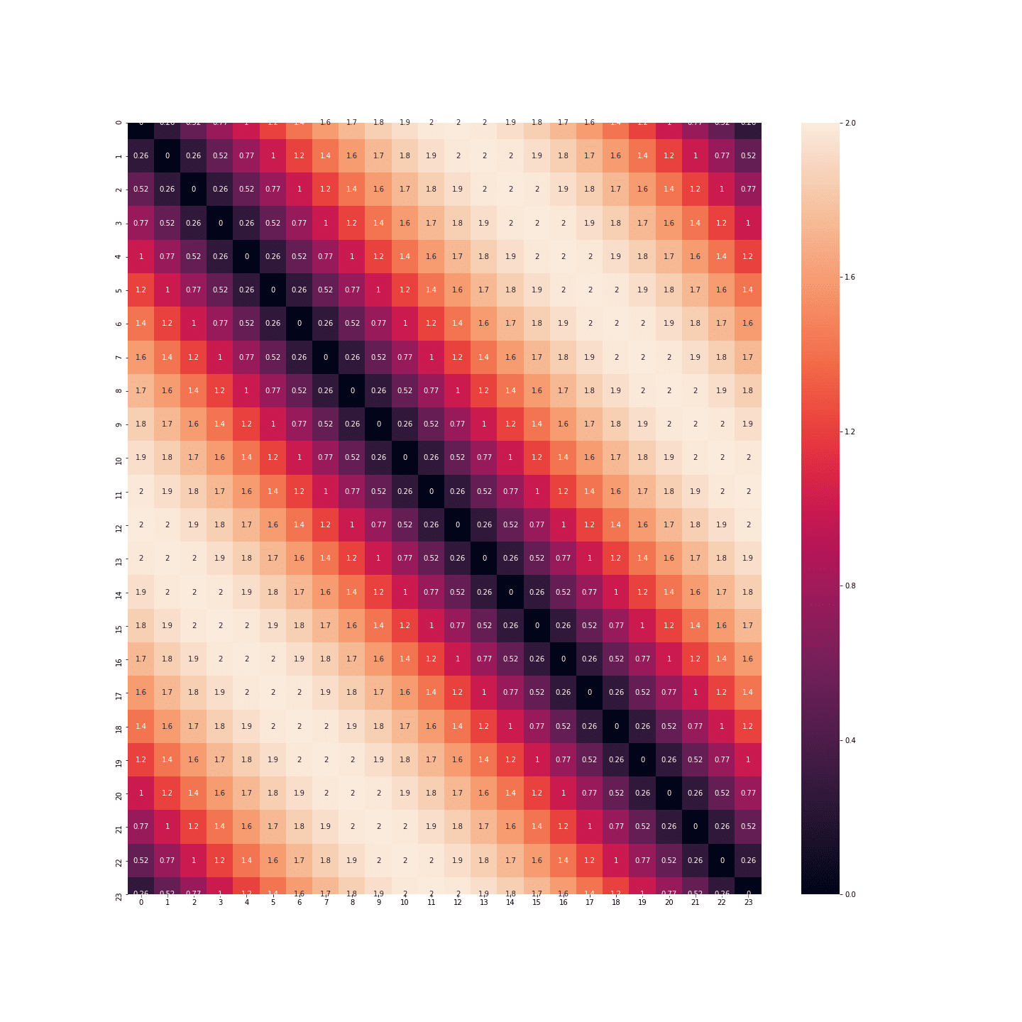
We therefore need to find a way of encoding this data without losing too much meaning. Let’s take the example of the hours of the day: for the moment, this data is represented in the form of numbers ranging from 0 to 23.
					df = pd.DataFrame({'heure': [i for i in range(24)]})
print(df.head())
If we keep this format, then the distance between 11pm and 0am will be 23 times the distance between 0am and 1am. But we know very well that this is not the case: on the contrary, the behaviour of an individual at 11pm, midnight or 1am is certainly very similar.
					plt.figure(figsize=(20, 20))
sns.heatmap(distance_matrix(df, df), annot=True)
plt.show()
What about binarisation: this time we don’t have the same problem. The distance between midnight and 1am is the same as between 11pm and midnight.
					df_2 = df.copy(deep=True)
df_2 = pd.get_dummies(df_2, columns=['heure'])
print(df_2.head())
plt.figure(figsize=(20, 20))
sns.heatmap(distance_matrix(df_2, df_2), annot=True)
plt.show()
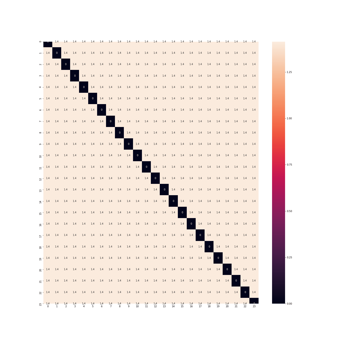
In fact, the distances between each hour are the same… There’s as much space between midnight and 1 a.m. as between midnight and noon… Once again, that’s no good.
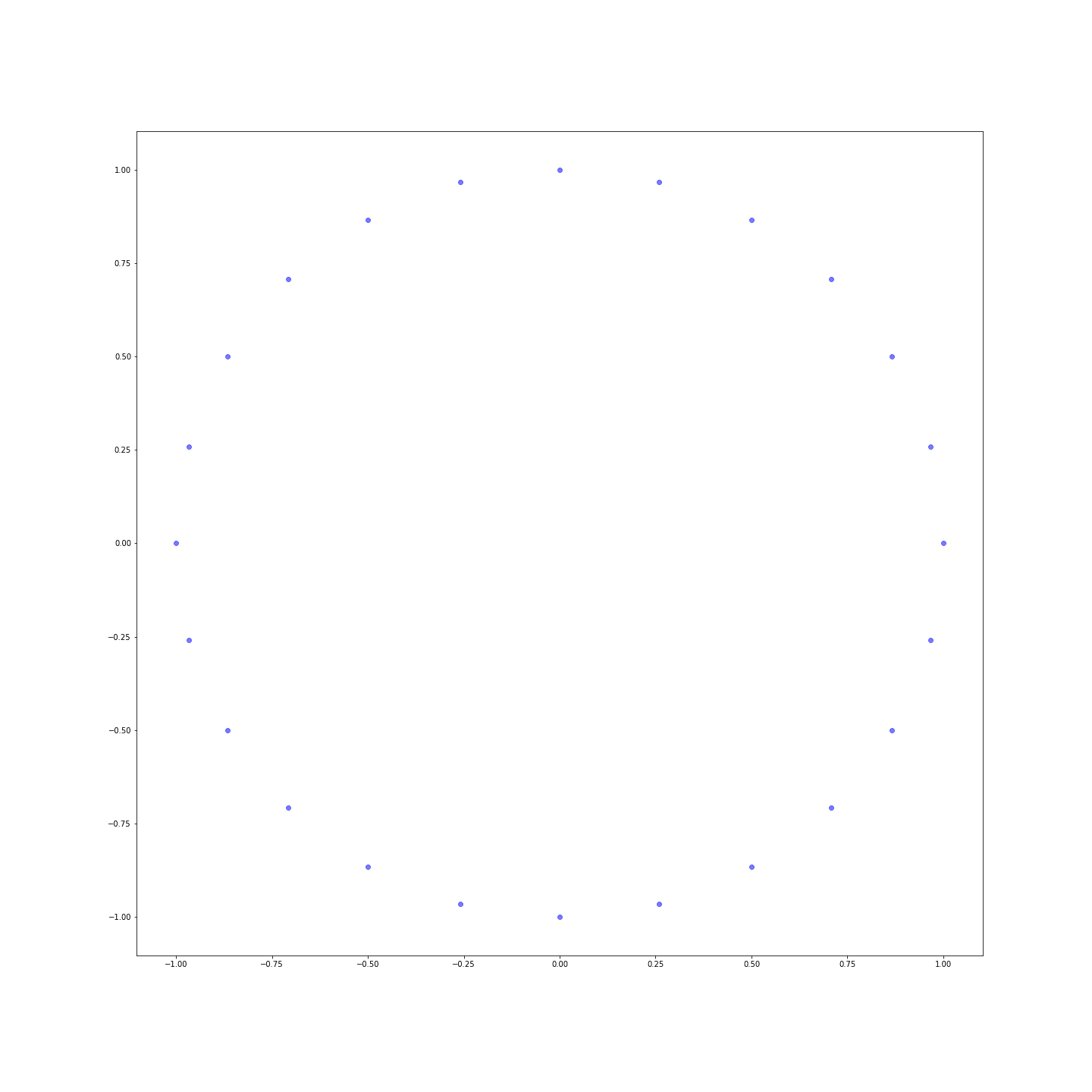
So we have to find another solution. This other solution comes from trigonometry. We’re not going to keep the absolute values, but simply take the cosine and sine of these values:
					df_3 = df.copy(deep=True)
df_3['sin_heure'] = df_3['heure'].apply(lambda h: np.sin(2 * np.pi * h / 24))
df_3['cos_heure'] = df_3['heure'].apply(lambda h: np.cos(2 * np.pi * h / 24))
df_3.drop(['heure'], axis=1, inplace=True)
plt.figure(figsize=(20, 20))
sns.heatmap(distance_matrix(df_3, df_3), annot=True)
plt.show()
Distances are much more nuanced! You can even represent the points in a plane to see that we’ve just reinvented the clock:
Conclusion
This stage of building and preparing variables just before training a Machine Learning algorithm is crucial, as it speeds up the algorithms and improves the results. The techniques are different for the different types of variable, but you need to keep them in mind to get off to a good start before applying the algorithms.
Want to learn more? Join one of our upcoming Bootcamps or ongoing training courses.
Contact us at contact@datascientest.com or on Linkedin on the DataScientest page!


